The Decadent Society: Maybe the internet isn’t actually a force for change

I recently read (well, absorbed via Audible) The Decadent Society by Ross Douthat.  tl,dr (summary, not opinion):

We are stuck in a civilizational rut, and have been there since either the 1980s or early 2000s, depending on how you count.

  • Technological progress has stalled since the early 2000s.  We’ve made no meaningful progress on the “big” initiatives (space exploration, fixing aging, flying cars, or AI) since the 2000s. 
  • Culture has not really innovated since the 1980s.  New art is derivative and empty, movies are mostly sequels, music is lousy covers, etc.
  • Politics has entrenched into two static camps bookended by rehashed politics from the 80s (neoliberal free trade vs soviet central planning and redistribution) 
  • Even religion is fairly stagnant.  Splinter sects and utopian communes are creepy and usually turn into weird sex cults, but represent spiritual dynamism.  Their decline indicates a stagnation in our attempts to find spiritual meaning in life. 
  • A sustained fertility rate decline in the developed world either indicates, causes, or in an unvirtuous cycle reinforces risk-aversion in both the economic and cultural planes.

In summary: Everything kinda sucks, for a bunch of reasons, and there’s a decent chance we’ll be stuck in the self-stabilizing but boring ShittyFuture™ for a long, long time. The Decadent Society is not an optimistic book, even when it pays lip service to “how we can escape” (spoiler: deus ex deus et machina).

While TDS doesn’t really make any strong claims about how we got into this mess, Douthat suggests that fertility declines, standard-of-living comforts, and the internet act as mechanisms of stasis, holding us in “decadence”. I want to talk about the last one — the internet.

Revisited opinion: the Internet might not actually be a net force for change

My pre-TDS stance on the internet as a force for social change was:  

“The internet is a change accelerator, because it massively increases the connection density between individuals.  On the bright side, this can accelerate scientific progress, give voice to unpopular but correct opinions, and give everyone a place to feel heard and welcome.

But the dark side of social media is an analog to Slotin and the demon core — Twitter slowly turns the screwdriver, carefully closing the gap between the uranium hemispheres for noble reasons, but sooner or later Dorsey will slip and accidentally fatally dose all onlookers with 10,000 rad(ical)s of Tweet poisoning.

Traditional society (with social pressure, lack of information transmission fidelity, slow communications) acted as a control rod, dampening feedback and suppressing unpopular opinions, for better or for worse, but are irrelevant in 2020.  Net-net, the world moves faster when we are all connected.”

TDS disagrees, contesting (paraphrased, only because I can’t grab a quote from Audible): 

“No, the internet is a force against social change.   Instead of marching in the street, rioting, and performing acts of civil disobedience, the young and angry yell on Twitter and Facebook.  Social media is an escape valve, allowing people to cosplay actual social movements by imitating the words and energy of past movements without taking actual risks or leaving home. 

But entrenched political structures don’t actually care what people are yelling online, and can at best pay lip service to the words while changing nothing.  While a lot of people get angry, nobody actually changes anything.”

The presented evidence is:

  1. The core topics of online debate haven’t really changed since the 1980s.  The left is still bookended by socialists and political correctness, and the right bookended by neoliberalism and reactionary religion.
  2. Non-violent protests, (marches and sit-ins) while not uncommon, are sanctioned, short, safe, and more akin to parades than true efforts at change.  No movement is even close to akin to Martin Luther King Jr’s march on Washington.
  3. Un-civil acts of disobedience (rioting, unsanctioned protests, bombings, etc) are nearly non-existent, even among radical groups, by historical standards.

(this is a short and summarized list, but the book obviously fleshes these points out in vastly greater and more effective depth)

The last point is at first take difficult to square with BLM protests, Occupy Wall Street, and occasional Mayday riots.  Media coverage makes them feel big.  But as Ross Douthat points out, in 1969, there were over 3,000 bombings in the United States (!!!), by a variety of fringe and radical groups (ex, the Weather Underground, the New World Liberation Front and the Symbionese Liberation Army). Even the tiniest fraction of this unrest would be a wildly radical departure from protests of the 2020s, and would dominate news cycles for weeks or months.

On the nonviolent side, the Civil Rights and anti-Vietnam-war movements were driven to victory by public demonstrations and mass protests.  Popular opinion and voting followed enthusiastic-but-minority protests and acts of nonviolent civil disobedience (ex, Rosa Parks).

Conclusion: activists in the 1960s, 70s and 80s engaged in physical, real-world acts of resistance, in a way the protests of the 2010s do not.  Why?  Suspect #1 is the internet: would-be activists can now use the internet as a safety-valve for toxic (but fundamentally ineffective) venting. But instead of these voices instigating social change, the voices stay online while the speakers pursue safe, uneventful daily lives.


I’m not 100% converted.  The magnifying glass of social media does change behavior in meaningful, conformist, ways, and I don’t think we’ve reached the endgame of internet culture.

But put in the context of the radical (or at minimum, society-transforming) movements America experienced every decade until the 2000s, TDS makes a compelling case that the ease of yelling online without leaving home comes at a hidden cost — real-world political change.

Reading

It’s easy to think without reading, but also easy to read without thinking.

I’ve started reading nonfiction again.  I have a good reason for stopping: I was stuck halfway through Proofs and Refutations for about a year and a half, and as a committed completionist, I couldn’t start any other books until it was done.  After powering through the dregs of P&R, I know a lot about…. proofs, less about polyhedrons, and I’m free to re-engage in educational literature.

It’s easy to read without reflecting, though.  I’d venture that 90% of “consumed content by volume” — especially online content — functions only to:

  1. Reinforce biases, in an (optimistically) intellectual circlejerk
  2. Get the reader frothing mad when they Read Stupid Opinions by Stupid People

I don’t think I’m uniquely bad at “intellectually honest reading” —  but “median human” is a low bar, and not one I’m confident I always clear.  If I’m going to go through the motions of reading brain books, I need a forcing function to ensure the input actually adjusts my priors;  if after having read a book, I haven’t changed my mind about anything, I’m wasting my time on comfortable groupthink.

My forcing function — until I get tired of doing it — will be to write something here.  There may be inadvertent side-effects (like accidentally reviewing the book, although I hope not), but my only commitment is: to outline at least one stance, large or small, the book has changed my mind on.  Or, lacking that, forced me into an opinion on a topic I hadn’t bothered to think about.

If I can’t find one updated stance, I’m wasting my time. Committing that stance to writing forces crystallization, and committing that writing to a (marginally) public audience forces me to make the writing not entirely stupid.

I make no commitment to keeping this up, but I waited to write this until I had actually written an un-review, so at least n=1, and by publicly declaring a plan, I can (hopefully) guilt myself into maintaining the habit.

Schrödinger’s Gray Goo

Scott Alexander’s review of The Precipice prompted me to commit to keyboard an idea I play with in my head: (1) The biggest risks to our humanity the ones we can’t observe, because they are too catastrophic to survive, and (2) we do ourselves a disservice by focusing on preventing the catastrophes we have observed.

Disclaimer: I Am Not A Physicist, and I’m especially not your physicist.

1. Missing bullet holes

The classic parable of survivorship bias comes from the Royal Air Force during WWII.  The story has been recounted many times

Back during World War II, the RAF lost a lot of planes to German anti-aircraft fire. So they decided to armor them up. But where to put the armor? The obvious answer was to look at planes that returned from missions, count up all the bullet holes in various places, and then put extra armor in the areas that attracted the most fire.

Obvious but wrong. As Hungarian-born mathematician Abraham Wald explained at the time, if a plane makes it back safely even though it has, say, a bunch of bullet holes in its wings, it means that bullet holes in the wings aren’t very dangerous. What you really want to do is armor up the areas that, on average, don’t have any bullet holes.

Why? Because planes with bullet holes in those places never made it back. That’s why you don’t see any bullet holes there on the ones that do return.

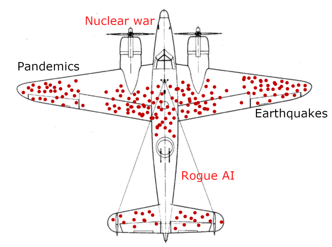
The wings and fuselage look like high-risk areas, on account of being full of bullet holes.  They are not. The engines and cockpit only appear unscathed because they are the weakest link.  

2. Quantum interpretations

The thought-experiment of Schrödinger’s cat explores possible interpretations of quantum theory:

The cat is penned up in a steel chamber, along with the following device: In a Geiger counter, there is a tiny bit of radioactive substance, so small, that perhaps in the course of the hour one of the atoms decays, but also, with equal probability, perhaps none; if it happens, the counter tube discharges and through a relay releases a hammer that shatters a small flask of hydrocyanic acid. If one has left this entire system to itself for an hour, one would say that the cat still lives if meanwhile no atom has decayed. The first atomic decay would have poisoned it. 

Quantum theory posits that we cannot predict individual atomic decay; the decay is an unknowable quantum event, until observed.  The Copenhagen interpretation of quantum physics declares that the cat’s state is collapsed when the chamber is opened — until then, the cat remains both alive and dead.

The many-worlds interpretation declares the opposite — that instead, the universe bifurcates into universes where the particle did not decay (and thus the cat survives)  and those where it did (and thus the cat is dead).

The many-worlds interpretation (MWI) is an interpretation of quantum mechanics that asserts that the universal wavefunction is objectively real, and that there is no wavefunction collapse. This implies that all possible outcomes of quantum measurements are physically realized in some “world” or universe.

The many-worlds interpretation implies that there is a very large—perhaps infinite—number of universes. It is one of many multiverse hypotheses in physics and philosophy. MWI views time as a many-branched tree, wherein every possible quantum outcome is realised. 

3. The view from inside the box

The quantum suicide thought-experiment imagines Schrödinger’s experiment from the point of view of the cat.  

By the many-worlds interpretation, in one universe (well, several universes) the cat survives.  In the others, it does. But a cat never observes universes in which it dies. Any cat that walked out of the box, were it a cat prone to self-reflection, would comment upon its profound luck. 

No matter how likely the particle was to decay — even if the outcome was rigged 100 to 1 — the outcome remains the same.  The cat walks out of the box grateful to its good fortune.

4. Our box

Or perhaps most dangerously, the cat may conclude that since the atom went so long without decaying, even though all the experts predicted decay, the experts must have used poor models which overestimated the inherent existential risk.

Humans do not internalize observability bias.  It is not a natural concept. We only observe the worlds in which we — as humans — exist to observe the present.  Definitionally, no “humanity-ending threat” has ended humanity.   

My question is: How many extinction-level threats have we avoided not through calculated restraint and precautions (lowering the odds of disaster), but through observability bias?

The space of futures where nanobots are invented is (likely) highly bimodal; if self-replicating nanobots are possible at all, they will (likely) prove a revolutionary leap over biological life.  Thus the “gray goo” existential threat posited by some futurists:

Gray goo (also spelled grey goo) is a hypothetical global catastrophic scenario involving molecular nanotechnology in which out-of-control self-replicating machines consume all biomass on Earth while building more of themselves

If self-replicating nanobots strictly dominate biological life, we won’t spend long experiencing a gray goo apocalypse.  The reduction of earth into soup would take days, not centuries:

Imagine such a replicator floating in a bottle of chemicals, making copies of itself…the first replicator assembles a copy in one thousand seconds, the two replicators then build two more in the next thousand seconds, the four build another four, and the eight build another eight. At the end of ten hours, there are not thirty-six new replicators, but over 68 billion. In less than a day, they would weigh a ton; in less than two days, they would outweigh the Earth

Imagine a world in which an antiBill Gates stands with a vial of grey goo in one hand, and in the other a geiger counter pointed at an oxygen-14 molecule — “Schrödinger’s gray goo”.  Our antiBill commits to releasing the gray goo the second the oxygen-14 molecule decays and triggers the geiger counter.

In the Copenhagen interpretation, there’s a resolution.  The earth continues to exist for a minute (oxygen-14 has a half-life of 1.1 minutes), perhaps ten minutes, but sooner or later the atom decays, and the earth is transformed into molecular soup, a giant paperclip, or something far stupider.  This is observed from afar by the one true universe, or perhaps by nobody at all.   No human exists to observe what comes next. [curtains]

In the many-worlds interpretation, no human timeline survives in which the oxygen-14 model decays. antiBill stands eternal vigil over that oxygen-14 atom: the only atom in the universe for which the standard law of half-life decay does not apply.

5. Our world

As a species we focus on preventing and averting (to the extent that we avert anything), the risks we are familiar with:

  • Pandemics
  • War (traditional, bloody)
  • Recessions and depressions
  • Natural disasters — volcanoes, earthquakes, hurricanes 

These are all bad.  As a civilization, we occasionally invest money and time to mitigate the next natural disaster, pandemic, or recession.

But we can agree that while some of these are civilizational risks, none of them are truly species-level risks.  Yet we ignore AI and nanotechnology risks, and to a lesser but real degree, we ignore the threat of nuclear war.  Why though?

  • Nuclear war seems pretty risky
  • Rogue AI seems potentially pretty bad
  • Nanobots and grey goo (to the people who think about this kind of thing) seem awful

The reasoning (to the extent that reasoning is ever given) is: “Well, those seem plausible, but we haven’t seen any real danger yet.  Nobody has died, and we’ve never even had a serious incident”

We do see bullet holes labeled “pandemic”, “earthquake”, “war”, and we reasonably conclude that if we got hit once, we could get hit again.  Even if individual bullet holes in the “recession” wing are survivable, the cost to human suffering is immense, and worth fixing.  Enough recession/bullets may even take down our civilization/plane. 

But maybe we are missing the big risks, because they are too big.  Perhaps there exist fleetingly few timelines with a “minor grey goo incident” which atomizes a million unlucky people.  Perhaps there are no “minor nuclear wars”, “annoying nanobots” or “benevolent general AIs”. Once those problems manifest, we cease to be observers.

Maybe these are our missing bullet holes.

6. So, what?

If this theory makes any sense whatsoever — which is not a given — the obvious followup is that we should make a serious effort to evaluate the probability of Risky Things happening, without requiring priors from historical outcomes. Ex:

  • Calculate the actual odds — given what we know of the fundamentals — that we will in the near-term stumble upon self-replicating nanotechnology
  • Calculate the actual odds — given the state of research — that we will produce a general AI in the near future?
  • Calculate the actual odds that a drunk Russian submariner will trip on the wrong cable, vaporize Miami, and start WWLast?

To keep things moving, we can nominate Nicholas Taleb to be the Secretary of Predicting and Preventing Scary Things.  I also don’t mean to exclude any other extinction-level scenarios. I just don’t know any others off the top of my head.  I’m sure other smart people do.

If the calculated odds seem pretty bad, we shouldn’t second guess ourselves — they probably are bad.  These calculations can help us guide, monitor, or halt the development of technologies like nanotech and general AI, not in retrospect, but before they come to fruition.

Maybe the Copenhagen interpretation is correct, and the present/future isn’t particularly dangerous.  Or maybe we’ve just gotten really lucky.  While I’d love for either of these to put this line of thought to bed, I’m not personally enthused about betting the future on it.

Ineffective Altruism

Texas Lt. Gov. Dan Patrick hung up a morality piñata when he had the audacity to state, on record, that he’d be willing to take risks with his life to prevent an economic meltdown:

No one reached out to me and said, ‘As a senior citizen, are you willing to take a chance on your survival in exchange for keeping the America that all America loves for your children and grandchildren?’ And if that is the exchange, I’m all in

Like many other moral-minded folk, Cuomo took a free swing at the piñata a few hours later, and snapped back with this zinger:

While this tweet is genetically engineered to be re-twatted, it is a ridiculous statement.  People put prices on human life all the time. Insurance companies price human lives. Legislators do it all the time when enacting regulations meant to protect human life, at a cost. 

On the flip side, it’s common to price out the cost of saving a life as well.  Effective Altruism is a niche but deeply principled movement which goes through great lengths to, with exacting rigor, price out the most effective way to save lives (and then, generally, donate 80% of their salary, time, and organs to those causes).

GiveWell is one of them.  They annually put together a version of this spreadsheet which calculates which charities are able to do the most work with the fewest dollars. 

It’s worth checking out. The math is more complicated than a naive observer would expect. It turns out that the shittiest things nature can do to a person often doesn’t kill them — Hookworms reduce educational attainment, blind children (!), and reduce life earnings, but rarely if ever… kill anyone. But because being blind and poor really sucks, many of GiveWell’s “most effective” charities attempt to eliminate hookworms and similar parasites.  

The way to massage this math onto a linear scale is to compute dollars per QALY saved, where QALY stands for Quality Adjusted Life Year — the equivalent of one year in perfect health.  By this measure, saving the life of an infant who would otherwise die in childbirth may save 75 QALYs, while saving the life of a senile, bedbound 80 year old may save 15 Quality Adjusted Life Hours.

This is a reasonable and principled method of making financial investments.  If you put stock in the Efficient Politics Hypothesis of government, stop here and feel good about the choices we’ve made.

2020

We have decided to, as a nation, spend an indefinite amount of time-money at home eating ice cream and mastrubating to Netflix, in a crusade to stop* the spread of COVID-19.  

*by some difficult to define metric

How much time-money?  $2.2 trillion is the down-payment stimulus package.  It’s a very conservative lower-bound estimate of the cost of recovery (it’s not expected that this will fix the economy by any means), so we can run with it.

How many lives are we saving?  The high upper bound is 2.2 million (assuming a 100% infection rate (not generally considered realistic), with a fatality rate of .66% (best estimate)).

This works out to a conveniently round, very lower bound, $1,000,000 per life saved (in the outcome that the US quarantine does prevent the majority of those deaths).  What about those QALYs? I’m not going to try sum it out, but we can look at a few suggestive stats:

  • The average age at death (due to COVID-19) in Italy is 79.5.  Italy’s average life expectancy is, for reference, 82.5*
  • 99% of Italian COVID-19 victims had pre-existing conditions (same source).

*I understand that the average life expectancy of a living 79 year old is higher than 82, which is why I’m not doing the math, so please shut up so we can move on.

We can speculate that no, we will not be saving very many QALYs.  But we can use the crude ‘lives saved’ metric instead to generously lower-bound our math, and run with 2.2 million raw.

Effectiver Altruism

My question: how does this calculus compare to effective altruism?  I was genuinely curious, because $1,000,000 per life saved is somewhat disproportionate to the charity pitches you see on television:

COMMERCIAL CUT. Enter UNICEF USA. 

“Save a Child for Only $39 per day*”

Exit right.

*assuming 70 year life expectancy @ $1,000,000 per life

I tried to find a toplist of “problems we can solve for X dollars to save Y lives per year”.  I did not find one. GiveWell (entirely reasonably) calculates the payout of donating to a specific charity, not of speculatively eliminating entire facets of human suffering.

So I put together a list.  These numbers aren’t precise.  They are very speculative.  My goal was to understand the orders of magnitude involved.

My focus was on problems we could solve that don’t involve serious tradeoffs, and don’t require hard political choices.  Trying to solve “war”, “suicide”, or “alcoholism” don’t cost money per se, they require societal committment we can’t put a price tag on.  For the most part, this leaves diseases.

I started with the highest-preventable-death diseases in the developing world, and ended up with 7 “campaigns” where we could non-controversially plug in money on one end, and pull extant wretched masses out of the other.   When considering the payout in lives saved from eradicating a disease, I used 30 years, because using “forever” is unfair (I’m sure there’s a time-decay value on life an actuary would prefer, but this was simple, and it doesn’t really change the conclusion).

Global Hunger

Hunger is the stereotypical “big bad problem”, and it wasn’t hard to find data about deaths:

Around 9 million people die of hunger and hunger-related diseases every year, more than the lives taken by AIDS, malaria and tuberculosis combined.

(for the record, this gave me some good leads on other problems).  How much would it cost to actually fix hunger?

Estimates of how much money it would take to end world hunger range from $7 billion to $265 billion per year.  

Pulling the high estimate, we get… 

Price Tag$265 billion
Lives Saved9,000,000
Cost Per Life$29,444 / life 

Malaria

Malaria sucks, and a lot of smart people want to spend money to get rid of it.  How many people does Malaria kill?

In 2017, it was estimated that 435,000 deaths due to malaria had occurred globally

What would it take to actually eliminate Malaria?

Eradicating malaria by 2040 would cost between $90 billion and $120 billion, according to the Gates Foundation

We can highball this estimate to get …. 

Price Tag$120 billion
Lives Saved13,050,000
Cost Per Life$9,195 / life

Tuberculosis

Tuberculosis is still a huge killer in the developing world, but it’s a killer we can put rough numbers on:

The Lancet study said reducing tuberculosis deaths to less than 200,000 a year would cost around $10 billion annually… a chronic lung disease which is preventable and largely treatable if caught in time, tuberculosis is the top infectious killer of our time, causing over 1.6 million deaths each year.

Price Tag$10 billion
Lives Saved42,000,000
Cost Per Life$7,143 / life

The math here is fuzzier than I’m comfortable with, but works out in the same ballpark as Malaria, so I feel OK about the result.

AIDS

Again, this wasn’t the cleanest math puzzle, but this report pegs the cost of ending AIDs at $26.2 billion/year for 16 years.  At 770,000 deaths per year from AIDs, we can (again, more mathematically than I like, ballpark the bill and lives saved over 30 years:

Price Tag$366.8 billion
Lives Saved10,780,000
Cost Per Life$33,963 / life

Maternal mortality

Like Tuberculosis, it ends up in the same ballpark as Malaria, so I’m inclined to believe it’s not more than half-asinine.

Dying in childbirth is bad, and kills people.  How much public health spending would it take to eliminate it?  Again, it was really hard to find good estimates, but we find that 

Researchers at UNFPA and Johns Hopkins University calculated that the annual cost of direct services, such as paying for medical staff, drugs and supplies when a woman is giving birth, will reach $7.8bn (£6.2bn) by 2030, up from an estimated $1.4bn last year.

To save how many lives?  

About 295 000 women died during and following pregnancy and childbirth in 2017

I’m honestly not sure how to compare these numbers, but if we ballpark that the $7.8 billion saves at least that number (?) each year, we work out to 

Price Tag$7.8 billion
Lives Saved295,000
Cost Per Life$26,440 / life

If you don’t like the fuzziness of the math, feel free to ignore it, or multiply it by 10.  Or whatever.

Measles

Measles is bad.  To convince you to vaccinate your children, I will attach a picture of a child with measles.

In the US, measles doesn’t flat-out kill many people, but in the developing world, it does:

Worldwide more than 140,000 people died from measles in 2018

What would it cost to actually eradicate measles?

Eradicating measles by 2020 is projected to cost an additional discounted $7.8 billion and avert a discounted 346 million DALYs between 2010 and 2050

Using the 30 year window I’ve been using, we end up with:

Price Tag$7.8 billion
Lives Saved140,000
Cost Per Life$1,857 / life

This is a shockingly low number, and can only conclude either that (1) I messed something up, or (2)  that we are a terrible, horrible, species for not having eradicated this decades ago.

Global Warming

Stepping outside of diseases, what about something big?  Global warming is big.

How many deaths might be attributed to climate change in the next century?  Obviously this is a make-believe number, but the number is definitely at least ‘several’:  

A report on the global human impact of climate change published by the Global Humanitarian Forum in 2009, estimated more than 300,000 deaths… each year

This is the lowest bound I can find short of flat-out AGW denialism.  It’s easy to find genocide-level projections, assuming crop failures in the developing world several orders of magnitude higher.  I won’t use them.

What’s the cost of fixing global warming?  Long-term, there’s no good answer yet, because the technology doesn’t exist.  But there are (speculative) ways we can slow it down for reasonable sums via carbon sequestration: 

Returning that land to pasture, food crops or trees would convert enough carbon into biomass to stabilize emissions of CO2, the biggest greenhouse gas, for 15-20 years… With political will and investment of about $300 billion, it is doable

We can use these numbers to price tag the cost/payoff of delaying global warming:

Price Tag$300 billion
Lives Saved6,000,000
Cost Per Life$50,000 / life

This is the most speculative guesstimate of all, so if you want to ignore it too, feel free.

Compare & Contrast

My original goal was to build a snarky visualization game which invited users to bin-pack global problem solving which worked out to less than $2T.  I was foiled, because you could do literally everything on this list for less — by my (fuzzy) calculations, you could solve global hunger*, malaria, tuberculosis, delay global warming 20 years, cure AIDs, eliminate maternal mortality, and eliminate measles, for “only” $1.4T.

*to be fair, this one is annual, not a permanent elimination.

But I had already invested the time learning how to use Data Studio, so I made the chart anyway:

(you can play with it yourself here)

Conclusion

What I feel confident saying — even using wildly generous numbers, since I am:

  • using the absolute upper bound for US COVID-19 deaths,
  • using crude deaths for a disease which primarily affects the elderly, instead of QALYs when comparing to diseases which affect primarily the young,
  • using just one ($2.2T) of many recovery packages we’re going to pay for, and
  • generously upper/lower bounding all the numbers

is that 

The COVID-19 economic shutdown is 20x as expensive per life as any other public health intervention the US could fund.  The most expensive intervention on this list — “delaying global warming” — cost $50,000/head.  We’re paying $1,000,000/head for COVID-19.

Now, there is a range of valid value statements, depending on your priors and beliefs in how creative fiscal policy can be:

  • “We should do both”
  • “We don’t have money to do either”
  • “Maybe civilization was a bad idea”

I’m not claiming to be a superhero here.  I’m not an Effective Altruist, and probably don’t register as an altruist at all.  But cheap platitudes annoy me, especially when used to shut down arguments.

In the end, the most meaningful, easiest, way Cuomo could have qualified his Tweet would have been 

We will not put a dollar value on American life

It’s not a great look, or a great tweet.  But as far as I can tell, it’s the only way to make the numbers — maybe — add up.

You Should be Angry

If you are under the age of 30, in the west, your future has turned grim.  In a fair world, you would be in the streets, screaming to get back to your job and building your life.

But instead, you are inside, while the police sweep empty streets.

As of late March 2020, the economies of the US, and most of western Europe, have been shut down.  This action does not have precedent, and it will cripple a generation in poverty and debt. Short term, this will likely mean 20% unemployment, vast GDP contraction, and trillions in debt.

This price will be paid by those under 30, to save — some of — those over 80.

It is not necessary, and is not worth the price.  It was an instinctive reaction, and I hope history will not be kind to the politicians who caved to it.  The best time to stop this mistake was before it was made. 

The second best time is right now.

You are being lied to

We have been asked to shut down the US for two weeks — and similar timeframes in Italy, France and elsewhere.  Two weeks (15 days, per the Feds) is a palatable number. Two weeks is a long Christmas break.  The technorati elite on Twitter think the shutdown is a vacation, and for them it is, because their checking accounts are overflowing from the fat years of the 2010’s.

Two weeks is not the goal, and it never was the goal.

The Imperial College report is the study which inspired the shutdowns — first of the Bay Area, then all of California, then New York.   This report measured the impact of various mitigation strategies. For those not “in the know” (aka, normal humans) there are two approaches to treating this pandemic:

  • Mitigation, where we “flatten the curve” enough to keep ICUs full, but not overflowing.  Eventually, we will build up herd immunity, and disease persists at a low level.
  • Suppression, where we eliminate the disease ruthlessly and completely.  

You don’t have to read the paper.  This graph tells you everything you need to know:

The orange line is the optimal “mitigation” strategy.  We try to keep ICUs full, try to keep businesses and schools running, and power through it.  But people will die.

The green line is suppression.  We shut down businesses, schools, universities, and all civic life.  Transmission stops, because there is no interaction with the outside world.  The economy does not depress — it stops.

We aren’t following the orange line, because: people will die.

That is the IC report’s conclusion: no amount of curve flattening gets us through this pandemic in a palatable timeframe.  Thus, we must suppress — for 18 months or longer — until we have a vaccine.  I’m not paraphrasing. This is the quote:

This leaves suppression as the preferred policy option…. this type of intensive intervention package … will need to be maintained until a vaccine becomes available (potentially 18 months or more)

Italy, France, California, New York, Illinois, and more in the days to come, have nearly shuttered their economies.  All schools, universities, and social gatherings are cancelled, at risk of ostracization or police enforcement. This is the green line.

By enacting the green line — closing schools, universities, and businesses — the US is choosing to give up on mitigation, and choose suppression.  This doesn’t mean 2 weeks of suffering. It means 2 years to start, and years of recession to follow.

We are eating the young to save the unhealthy old

COVID-19 does not kill, except in the rarest of exceptions, the young.   Old politicians will lie to you. The WHO and CDC will lie to you — as they lied about masks being ineffective — to nudge you to act “the right way”.  Do not trust them.

Here are the real, latest, numbers:

In South Korea, for example, which had an early surge of cases, the death rate in Covid-19 patients ages 80 and over was 10.4%, compared to 5.35% in 70-somethings, 1.51% in patients 60 to 69, 0.37% in 50-somethings. Even lower rates were seen in younger people, dropping to zero in those 29 and younger.

No youth in South Korea has died from COVID-19.  Fleetingly few of the middle aged. Even healthy seniors rarely have trouble.  The only deaths were those seniors with existing co-morbidities.  In Italy, over 99% of the dead had existing illnesses:

With the same age breakdown for deaths as South Korea:

As expected, the numbers for the US so far are the same:

More than raw numbers, the percent of total cases gives a sense of the risk to different age groups. For instance, just 1.6% to 2.5% of 123 infected people 19 and under were admitted to hospitals; none needed intensive care and none has died… In contrast, no ICU admissions or deaths were reported among people younger than 20.

These numbers are under-estimates — the vast majority of cases were never even tested or reported, because the symptoms don’t even exist in many of the healthy.   The vast majority of the young would not even notice a global pandemic, and none — generously, “fleetingly few” would die.

The young — the ones who will pay for, and live through, the recession we have wrought by fiat — do not even benefit from the harsh medicine we are swallowing.  But they will taste it for decades. 

This is not even necessary

To stop COVID-19, the west shut itself down.  East Asia did not. East Asia has beaten COVID-19 anyway.

China is where the disease started (conspiracy theories aside).  Through aggressive containment and public policy, the disease has been stopped.  Not even mitigated — stopped:

There are two common (and opposite) reactions to these numbers:

  1. China is lying.  This pandemic started on Chinese lies, and they continue today.
  2. China has proven that the only effective strategy is containment

Neither is true.  But we also know that China can, and has, used measures we will never choose to implement in the west.  China can lock down cities with the military. China can force every citizen to install a smartphone app to track their movement, and alert those with whom they interacted.

So we can look at the countries we can emulate:  South Korea, Japan, Taiwan, and Singapore.  None (well, at most one) of them are authoritarian.  None of them have shut down their economies. Everyone one of them is winning against COVID-19.

South Korea

South Korea is the example to emulate.  The growth looked exponential — until it wasn’t:

South Korea has not shut down.  Their economy is running, and civic life continues, if not the same as normal, within the realm of normal.  So how did they win, if not via self-imposed economic catastrophe?  Testing.

The backbone of Korea’s success has been mass, indiscriminate testing, followed by rigorous contact tracing and the quarantine of anyone the carrier has come into contact with

Their economy will suffer not because of a self-imposed shutdown, but because the rest of the world is shutting itself down. 

Singapore

Singapore won the same way: by keeping calm, testing, and not shutting down their economy.

Singapore is often the “sure… but” exception in policy discussions.   It’s a hyper-educated city-state. Lessons don’t always apply to the rest of the world. But a pandemic is different.  Pandemics kill cities, and Singapore is the world’s densest city. If Singapore can fix this without national suicide, anyone can.  So what did they do? 

  • Follow contacts of potential victims, and test
  • Keeping positives in the hospital
  • Communicate
  • Do not panic 
  • Lead clearly and decisively

I could talk about Japan and Taiwan, but I won’t, because the story is the same: Practice hygiene.  Isolate the sick. Social distance. Test aggressively.   

And do not destroy your economy.

“The economy” means lives

The shutdown has become a game — fodder for memes, fodder for mocking Tweets, and inspirational Facebook posts, because it still feels like Christmas in March.  

It is not.  If your response to the threat of a recession is:

  • “The economy will just regrow”
  • “We can just print more money”
  • “We just have to live on savings for a while”

The answer is simple: you either live a life of extraordinary privilege, are an idiot, or both.  I can try to convince you, but first, ask yourself:  how many people have the savings you’ve built up — the freedom to live out of a savings account in a rough year? I’ll give you a hint:  almost none.

Likewise, working from home is the correct choice, for anyone who can manage it. Flattening the curve is a meaningful and important improvement over the unmitigated spread of this disease. But the ability to work from home is a privilege afforded to not even a third of Americans:

According to the Bureau of Labor Statistics, only 29 percent of Americans can work from home, including one in 20 service workers and more than half of information workers

If you are able to weather this storm by working from home, congratulations — you are profoundly privileged. I am one of you. But we are not average, and we are not the ones who risk unemployment and poverty. We are not the ones who public policy should revolve around helping. The other 71% of Americans — who cannot — are the ones who matter right now.

To keep the now-unemployed from dying in the streets, we will bail them out.  And that bailout, in the US alone, just to start, will cost a trillion dollars.  That number will almost certainly double, at a minimum, over the next two years.  

What else could we spend two trillion dollars on?   To start, we could void all student debt:  $1.56 trillion, as of 2020.  We could vastly expand medicare or medicaid.  You can fill in the policy of your choice, and we could do it.  But we won’t.

We are borrowing money to pay for this self-inflicted crisis.  We should be spending that money investing in the future — perhaps freeing students from a life of crippling debt — but instead, we are throwing it at the past.

The rest of the world

The US is not the world.  The US will muddle through, no matter how poor our decisions, usually (but not always) at the cost of our futures, not our lives.  The rest of the world does not have this luxury.

GDP saves lives.  GDP is inextricably linked to life expectancy, child mortality, deaths in childbirth, and any other measure of life you want to choose.  This is so well proven that it shouldn’t require citations, but I’ll put up a chart anyway:

A depression will set back world GDP by years.  The US and Europe buy goods from the developing world.  The 2008 recession — driven primarily by housing and speculation in western markets — crushed the economies not just of developed nations, but the entire world:

we investigate the 29 percent drop in world trade in manufactures during the period 2008-2009. A shift in final spending away from tradable sectors, largely caused by declines in durables investment efficiency, accounts for most of the collapse in trade relative to GDP

If you are unswayed by the arguments that a self-inflicted depression will hurt the working poor in the US, be swayed by this — that our short-sighted choices will kill millions in the developing world.

How did we get here?

Doctors are not responsible for policy.  They are responsible for curing diseases.  It is not fair to ask them to do more, or to factor long-term economic policy into their goal of saving lives right now.   We elect people to balance the long-term cost of these decisions.  We call them politicians, and ours have failed us.

The solution to this crisis is simple — we do our best to emulate East Asia.  We isolate the sick. We improve sanitization.  We mobilize industry to build tests, ventilators, and respirators, as fast as we can — using whatever emergency powers are needed to make it happen.   And we do this all without shutting down the economy, the engine which pays for our future.

We do the best we can.  And accept that if we fail, many of the sickest elderly will die.  

Next time will be different.  We will learn our lessons, be prepared, and organize our government response teams  the way that Taiwan and South Korea have. We will have a government and a response which can protect every American.

But now, today, we need to turn the country back on, and send the rest (the 71% who can’t work from home) back to work. We owe them a future worth living in. 

The best gift the Coronavirus can give us? The normalization of remote work

tl,dr: Covid-19, if (or at this point, “when”) it becomes a full pandemic, is going to rapidly accelerate the shift to remote-first tech hiring.  This is an amazing thing. It’s too bad it’ll take a pandemic to get us there.

The focus over the past couple weeks has been on how a pandemic will affect the economy.  This is a reasonable question to ask. But a brief economic downturn is just noise compared to the big structural changes we’ll see in turn — that long-term quarantine and travel restrictions will normalize remote work. It’s already happening, especially in tech companies.  

Remote work is a revolutionary improvement for workers of all stripes and careers, but I’m a tech worker, so I’ll speak from the perspective of a one.

Software development is second only to sales in ability to execute at full capacity while remote*, if given the opportunity.  But willingness to perform tech-first remote hiring has ground forward glacially slowly, especially at the largest and hippest tech companies — and at times, even moved backwards

*I’ve known top sales reps to make their calls on ski lifts between runs.  Software devs can’t quite match that quality-of-life boost.

A prolonged quarantine period (even without a formal government quarantine, tech companies will push hard for employees to work from home) will force new remote-first defaults on companies previously unwilling to make remote work a first-class option:

  • Conversations will move to Slack, MS teams, or the equivalent
  • Videoconferenced meetings will become the default, even if a few workers make it into the office
  • IT departments without stable VPNs (all too common) will quickly fix that problem, as the C-suite starts working from home offices

The shift to normalized remote work will massively benefit tech employees, who have been working for decades with a Hobson’s choice of employment — move to a tech hub, with tech-hub salaries, and spend it all on cost-of-living, or eat scraps:

  • Cost-of-living freedom: SF and New York are inhumanly expensive. Make it practical to pull SF-salaries while living in the midwest? Most SF employees have no concept of how well you can live on $250k in a civilized part of the country.
  • Family balance freedom: operating as an on-site employee with children is hard, and working from home makes it wildly easier to balance childcare responsibilities (trips to school, childcare, etc etc).
  • Commutes suck. Good commutes suck. Terrible commutes are a portal into hell. What would you pay to gain two hours and live 26-hour days? Well, working from home is the closest you can get.

I don’t mean to be callous — deaths are bad, and I wish it upon nobody. But the future is remote-first, and when we get there, history will judge our commute-first culture the same way we judge people in the middle ages for dumping shit on public streets.

I wish it didn’t take a global pandemic to get us here, but if we’re looking for silver linings in the coffins — it’s hard to imagine a shinier one that the remote-normalized culture we’re going to build, by fire, blood, and mucous, over the next six months.  

I’ll take it.

It turns out that Ithaca, Traverse City, and Roswell are good places to hang out while the world burns

Alright, inspired by recent events, I’ve spent a bit (well, a lot) of time over the past couple months scratching an itch called “figuring out where in the US is safe from Armageddon.”

I had a lot of fun learning how to use a medley of QGIS features, learning where to find USGS GIS data, researching what targets the Russians/Chinese/French are are likely to target in a nuclear war, and learning how to render all this using Mapbox GL JS

I’ve continued adding all this data as layers on my pet website bunker.land, and now if you want, you can map any of the risk layers I’ve added:

  • Tornadoes
  • Earthquakes
  • Sea level rise
  • Hurricanes
  • Wildfires
  • Possible targets in a nuclear war

But it’s time to wrap it up and ask an actual actionable question:

“Given these potential hazards —both natural and man-made — which US cities are the least prone to unexpected natural or man-made disaster?”

Rules

As a ground rule, I limited the list of towns/cities I’d evaluate to those with populations of 10,000 or more, for a couple reasons:

  1. 10,000 is a reasonable cutoff for “towns which have all the basic infrastructure for urban life” – grocery stores, restaurants, etc (your threshold may be wildly different, and you should feel free to filter the data differently.)
  2. Even mapping out cities of 10,000+ was computationally challenging — it took a full 24 hours for me to do the QGIS join I needed on this data.  Mapping out towns of 1,000+ would have required a more sophisticated process.  

Data

Before I get too deep, I want to be very clear about all the relative metrics used here: they are based only on my judgement.  The raw data is all pretty well-sourced — I’m not fabricating any data points — but the weights of the relative risk bands are judgement-based. Interpret as you will.

First, I had four natural-disaster risk maps to parse: hurricanes, tornadoes, earthquakes, and wildfires.  I broke each of these risk zones into 4 hazard bands, informally “low, medium, high, and very high.”

Earthquakes: I was able to fairly directly translate earthquake data into hazard bands based on the USGS input data.  The units here takes a bit of work to wrap your head around (“peak acceleration as a % of gravity”), but it was easy enough to break this data into four bands:  10-20, 20-50, 50-70, and 70+

Wildfires: see this post for how I translated wildfire hazard data into discrete hazard bands. Lots of judgement involved.

Tornados: see this post for how I found tornado hazard zones.

Hurricanes:  see this post for how I generated a hurricane risk map.

I assigned each of these zones a risk score.  These scores are entirely judgement-based (although as I’ll discuss later, these scores don’t actually matter much for the purposes of this post): 

  • Low: 1
  • Medium: 4
  • High: 6
  • Very high: 8

Second, there’s the list of plausible infrastructure targets in a nuclear war.  For these purposes that means: military-capable airports, ports, military bases, state capitals, power plants (1+ GW), railyards, and nuclear missile silos. 

I’ve used Alex Wellerstein’s NUKEMAP to judge “how close is too close” to a nuclear target.  I went with a 5MT nuclear warhead (a standard Chinese ICBM loadout), which gives four hazard bands:

  • Fireball: within 2km
  • 5 PSI airblast: within 12km
  • 3rd-degree burns: within 25km
  • 1 PSI airblast: within 34km

Like with the natural disasters above, I assigned each of these zones a risk score:

  • Fireball: 10
  • 5 PSI airblast: 5
  • 3rd-degree burns: 2
  • 1 PSI airblast: 1

You can read a bit more about the methodology I used here.

If you want to do your own calculations, with your own weights, here are the raw layers I used, and the script I used to calculate weights (I know it’s a mess.  It’s a personal project. Don’t judge me). You can reference this post for the script that turns the layers into the combined columnar cities.csv file.

Results

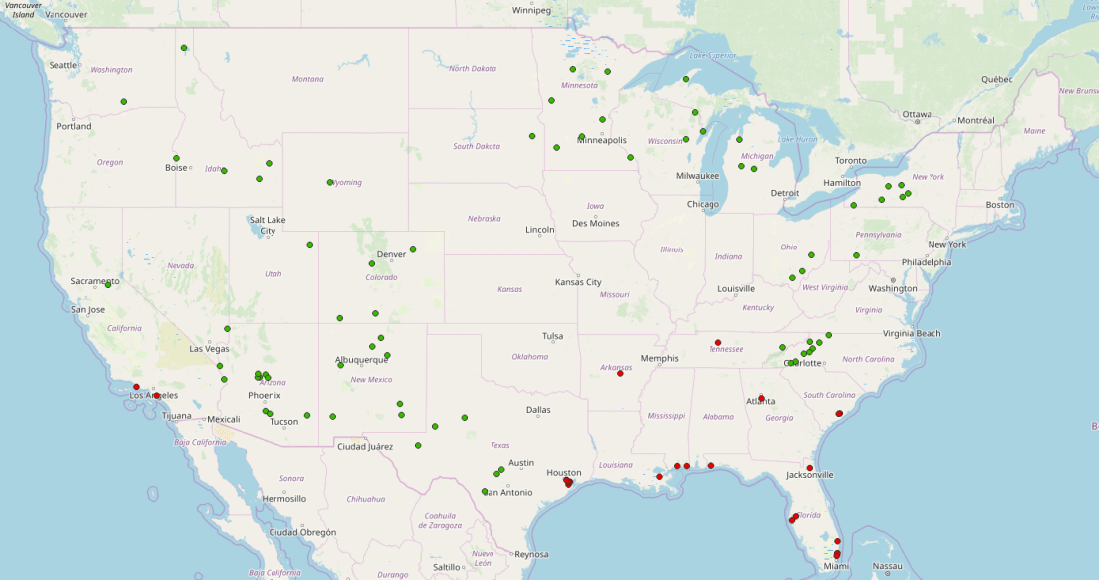
So, crunched all of the above data, and found…. 72 cities of 10,000+ people with no measurable risk, by those metrics.  Here’s the map:

I’ve put a map of these cities on MapBox: you can explore the map here.  I’ve also included the worst 25 cities for reference, but I’ll save that discussion for a later post.

Observations

In no particular order:

Most of the Midwest is entirely ruled out because of the risk of tornadoes.  This may or may not be a reasonable bar, by your own judgement.

I had technical difficulties factoring flooding from sea level rise into these rankings.  “Luckily”, coastal cities ended up being death-traps for unrelated reasons, so I didn’t need to do any manual fiddling to exclude them.

There were fewer low-risk cities in Idaho, Nevada, Utah, and Montana than I expected.  Turns out, this is because:

  • The area around Yellowstone has a meaningful earthquake risk.  Given that Yellowstone is still an active supervolcano, this seems fair.
  • A lot of areas in Idaho and Nevada are totally safe from a risk perspective, but simply don’t have any cities of 10,000+ people which register.

If you end up working through the data from scratch, note that I did remove three cities which only made the list because of bad data:

  • Juneau and Anchorage.  Turns out, these cities have a huge nominal footprint, so the “city center” is actually in the middle of nowhere.  The real city centers are next to all sorts of important infrastructure (including a state capital).  I removed these from the “safe” list.
  • Newport OR is actually in a high-earthquake risk zone, but my map data puts the city in the middle of a river, which doesn’t register an overlap.  Instead of fiddling with the data, I just removed it.

There are likely others — I’m not going to sort through the remaining 72 by hand, but be aware that there are probably flukes.

Largest cities

This is actually a longer list of cities than I anticipated: I thought I’d get 1-2 strangely isolated cities free of hazards, not 72.  So we have a bit of leeway to interpret this data. The most straightforward question an urbanite would ask is, 

“So what’s the largest city with no measurable hazards?”

We can answer that pretty easily.  Here are the top 9:

CityPopulation
Prescott Valley, AZ97,066
Casa Grande, AZ58,632
Ithaca, NY55,439
Lake Havasu City, AZ55,341
Traverse City, MI49,806
Bullhead City, AZ49,531
Roswell, NM49,119
Maricopa, AZ46,741
Prescott, AZ42,731

Now, here’s where I’m going to roleplay Solomon:  I don’t care what this data says, nowhere — absolutely nowhere — in Arizona is a good place to ride out the apocalypse:

  • Arizona is, at best, barely inhabitable without Air Conditioning.  Global warming will only make this worse.  There is absolutely no point in surviving a nuclear war only to burst into flames the second your HVAC loses grid power.
  • Central Arizona is only hydrated by a gargantuan public works project.  An entire river is pumped over the Buckskin mountains to keep the geriatric heart of Phoenix feebly beating.  The minute a disaster strikes, Phoenix is going to be full of Sandworms and fremen raiding nursing homes to dessicate the elderly and steal their water.
  • The few — very few — places in Arizona with natural water are along the Colorado river.  If there’s a breakdown of law and order, Las Vegas is either going to (1) close the Hoover Dam and take all the water, or (2) get nuked and wash everything downstream of the Glen Canyon dam into Baja California.

So I am striking everything in Arizona from this list: Prescott Valley, Casa Grande (honestly, it’s a suburb of Phoenix, it’s just that the suburbs of Phoenix threaten to circle the earth) , Lake Havasu City, Bullhead City, Maricopa, and Prescott (why is this even distinct from Prescott Valley?)

Which leaves 3 cities.

The winners

This leaves us three cities which are (1) fairly large, (2) sheltered from natural disasters and (3) have absolutely nothing worth destroying: 

  1. Ithaca, NY
  2. Traverse City, MI
  3. (I promise I did not tamper with the data to get this) — Roswell, NM 

Ithaca

Ithaca was a bit surprising, but it’s reasonable in retrospect:

  • As a college town, Ithaca is reasonably large, driving it to the top of this list
  • As far as I can tell, it has no industry whatsoever
  • Although New York City is a Big Deal, upstate New York is pretty empty overall.  There’s really not much in the area that shows up in the target maps I generated:

So… not what I expected, but seems reasonable overall.

Traverse City

I have never heard of Traverse City MI before.  After reading the Wikipedia page, I have learned that “the Traverse City area is the largest producer of tart cherries in the United States”.  Apparently that is about it.

There are some military bases in the general area, but nothing that registers in the 34km buffer: 

I have very little else to say about Traverse City, except that it seems safe from disaster.

Roswell

I will be honest: I’ve always thought of Roswell in the context of UFO jokes, and never really considered that Roswell is a real city, full of real people, living real lives.

It turns out that it is a real city, but the largest industry is “Leprino Foods, one of the world’s largest mozzarella factories”, which is likely not a first-strike military target. It also turns out that the infamous Roswell Air Force Base closed in the late 60s, so there are no longer any military targets in the vicinity.  

In fact, the closest risk of any significance, by these metrics, is a wildfire hazard zone to the east:

So Roswell, alien jokes aside, actually registers as the third-largest city utterly* safe from natural or man-made disaster.

*well, as best as I can figure.

Conclusions

I tried pretty hard to not pre-register expectations so I wouldn’t unconsciously bias my results.  So I don’t have anything interesting to say, like “that’s exactly what I expected” or “wow, I thought city XYZ would make the list!” 

I feel pretty good about these results because:

  • They are geographically diverse.  It’s not all in some weird cluster because of bad data.
  • I didn’t end up having to draw an arbitrary cutoff.  72 is a good number of cities to greenlight.
  • Roswell is #3, which I still find hilarious.

I’ll do one last followup post with the worst-25 cities by these metrics.  Spoiler alert: it’s mostly the gulf coast and LA. But I’ll hopefully have that up in a week or two.

QGIS scripting — Checking point membership within vector layer features

Hit another QGIS snag. This one took a day or so to sort through, and I actually had to write code. So I figured I’d write it up.

I struggled to solve the following problem using QGIS GUI tools:

  • I have a bunch of points (as a vector layer)
  • I have a bunch of vector layers of polygons
  • I want to know, for each point, which layers have at least one feature which contain this point

Speaking more concretely: I have cities (yellow), and I have areas (pink). I want to find which cities are in the areas, and which are not:

I assumed this would be a simple exercise using the GUI tools. It might be. But I could not figure it out. The internet suggests doing a vector layer join, but for whatever reason, joining a point layer to a vector layer crashed QGIS (plus, this is slow overkill for what I need — simple overlap, not full attribute joins).

Luckily, QGIS has rich support for scripting tools. There’s a pretty good tutorial for one example here. The full API is documented using Doxygen here. So I wrote a script to do this. I put the full script on GitHub —you can find it here.

I will preface this before I walk through the code — this is not a clever script. It’s actually really, really dumb, and really, really slow. But I only need this to work once, so I’m not going to implement any potential optimizations (which I’ll describe at the end).

First, the basic-basics: navigate Processing  → Toolbox. Click “Create New Script from Template”

This creates — as you might expect — a new script from a template. I’ll go over the interesting bits here, since I had to piece together how to use the API as I went. Glossing over the boilerplate about naming, we only want two parameters: the vector layer with the XY points, and the output layer:

    def initAlgorithm(self, config=None):

        self.addParameter(
            QgsProcessingParameterFeatureSource(
                self.POINT_INPUT,
                self.tr('Input point layer'),
                [QgsProcessing.TypeVectorPoint]
            )
        )

        self.addParameter(
            QgsProcessingParameterFeatureSink(
                self.OUTPUT,
                self.tr('Output layer')
            )
        )

Getting down into the processAlgorithm block, we want to turn this input parameter into a source. We can do that with the built-in parameter methods:

        point_source = self.parameterAsSource(
            parameters,
            self.POINT_INPUT,
            context
        )

        if point_source is None:
            raise QgsProcessingException(self.invalidSourceError(parameters, self.POINT_INPUT))

A more production-ized version of this script would take a list of source layers to check. I could not be bothered to implement that, so I’m just looking at all of them (except the point layer). If it’s a vector layer, we’re checking it:

        vector_layers = []
        
        for key,layer in QgsProject.instance().mapLayers().items():
            if(layer.__class__.__name__ == 'QgsVectorLayer'):
                if(layer.name() != point_source.sourceName()):
                    vector_layers.append(layer)
                else:
                    feedback.pushInfo('Skipping identity point layer: %s:' %point_source.sourceName())

We want our output layer to have two types of attributes:

  • The original attributes from the point layer
  • One column for each other layer, for which we can mark presence with a simple 0/1 value.
        output_fields = QgsFields(point_source.fields())
        
        for layer in vector_layers:
            feedback.pushInfo('layer name: %s:' %layer.name())
            
            field = QgsField(layer.name())
            output_fields.append(field)

Similar to the input, we want to turn the parameter into a sink layer:

        (sink, dest_id) = self.parameterAsSink(
            parameters, 
            self.OUTPUT,
            context,
            output_fields,
            point_source.wkbType(),
            point_source.sourceCrs()
        )

        if sink is None:
            raise QgsProcessingException(self.invalidSinkError(parameters, self.OUTPUT))

Although it seems like a “nice to have”, tracking progress as we iterate through our points is pretty important; this script ran for 24 hours on the data I ran through it. If I had hit the 2 hour mark with no idea of progress — I’d certainly have given up.

Likewise, unless you explicitly interrupt your script when the operation is cancelled, QGIS has no way to stop progress. Having to force-kill QGIS to stop a hanging processing algorithm is super, duper, annoying:

        points = point_source.getFeatures()        
        total = 100.0 / point_source.featureCount() if point_source.featureCount() else 0

        for current, point in enumerate(points):

            if feedback.isCanceled():
                break

            feedback.setProgress(int(current * total))

From here on, we iterate over the target layers, and add to the target attributes if point is present in any feature in the target layer:

            attr_copy = point.attributes().copy()

            for layer in vector_layers: 
            
                features = layer.getFeatures()
                feature_match = False
                geometry = point.geometry()

                for feature in features:
                    
                    if (feature.geometry().contains(geometry)):
                        feature_match = True
                        break
                    
                if(feature_match):
                    attr_copy.append(1)
                else:
                    attr_copy.append(0)

Last but not least, we just output the feature we’ve put together into the output sink:

            output_feature = QgsFeature(point)
            output_feature.setAttributes(attr_copy)
            feedback.pushInfo('Point attributes: %s' % output_feature.attributes())
            sink.addFeature(output_feature, QgsFeatureSink.FastInsert)

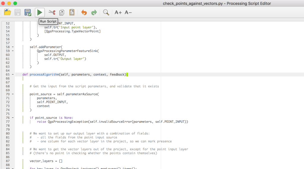
And that’s about it (minus some boilerplate). Click the nifty “Run” button on your script:

Because we wrote this as a QGIS script, we get a nice UI out of it:

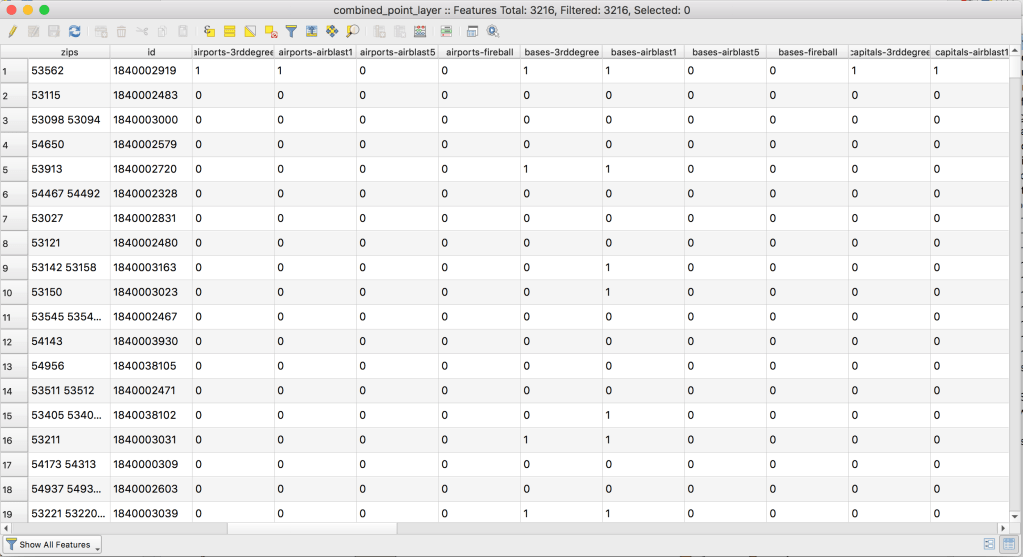
When we run this, it creates a new temporary output layer. When we open up the output layer attribute table, we get exactly what we wanted: for each record, a column with a 0/1 for the presence or absence within a given vector layer:

Perfect.

Now, this script is super slow, but we could fix that. Say we have n input points and m total vector features. The obvious fix is to run in better than n*m time — we’re currently checking every point against every feature in every layer. We could optimize this by geo-bucketing the vector layer features:

  • Break the map into a 10×10 (or whatever) grid
  • For each vector layer feature, insert the feature into the grid elements it overlaps.
  • When we check each point for layer membership, only check the features in the grid element it belongs to.

If we’re using k buckets (100, for a 10×10 grid), this takes the cost down to, roughly, k*m + n*m/k, assuming very few features end up in multiple buckets. We spend k*m to assign each feature to the relevant bucket, and then each point only compares against 1/k of the vector features we did before.

I’m not implementing this right now, because I don’t need to, but given the APIs available here, I actually don’t think it would be more than an hour or two of work. I’ll leave it as an exercise to the reader.

Anyway, I’d been doing my best to avoid QGIS scripting, because it seemed a bit hardcore for a casual like me. Turned out to be pretty straightforward, so I’ll be less of a wimp in the future. I’ll follow up soon with what I actually used this script for.

‘Education Facts’ Labeling — A Modest Proposal to Fix the Student Debt Crisis

College debt is a hot topic right now.  Elizabeth Warren wants to cancel most of it.  Bernie Sanders wants to cancel all of it. Donald Trump loves the idea of bankruptcy (not from college debt — just as a general principle).  

But since forgiving student debt, like any meaningful reform in America, is a silly pipe dream, let’s instead fix it by eliminating information asymmetry.  Because if there’s anything American college students are not, it’s informed consumers.

Colleges are expensive, and costs have grown wildly faster than overall wage growth.  We all know that some majors, and some for-profit colleges, provide almost no value.  But since undergraduate education is a cash cow for universities, self-regulation of tuition growth — growth used to boost spending on new dorms, rec centers, and bureaucrats — by the universities themselves is utterly unrealistic. 

The crowning achievement of the Food and Drug Administration — right alongside keeping children from dying of Salmonella — is accurate, mandatory, Nutrition Facts.  Nutrition Facts are a universal constant. Without them, the American consumer would be forced to perform difficult calculus like “quantify how much lard is in a medium-sized lardburger.”

So, building on the wild success of Nutrition Facts, here’s my modest proposal: Federal Department of Education mandated Education Facts labeling:

This summary statistics table will give students the ability to identify which colleges can actually improve their futures, and which exist mainly as a parasitic drain on society.  Advertising will be totally legal — but must come coupled with vital statistics.  These will focus on:

  • Debt.  The big kahuna.  How far underwater is the average Philosophy major when they swim off the graduation stage?
  • Salary and employment.  5 years post-graduation, where is your career?  Can you dig yourself out of your debt before your children die?
  • Grad school acceptance.  If you’re going to die in debt, at least do it in style.  Can your undergraduate education help shelter you from the real-world with another 8-15 years of graduate school?

These statistics won’t just be available online.  McDonalds publishes nutrition facts online, but the mobility scooter market is as hot as ever.  These Education Facts will be attached to every form of advertisement produced by an institution of higher learning.  

To help build a vision of this fully-informed world, I have illustrated a few examples: 

College brochures — The paper deluge that every high-school student wades through during Junior through Senior years.  Education Facts would help triage this garbage pile, by filtering the wheat from the for-profit scams:

[source]

Billboards: Colleges are huge on billboards now-days.  It is only appropriate that claims like “career launching” be substantiated, in similarly giant font:

[source]

Sports:  College sports are, without a doubt, the most ironic yet effective form of higher-education advertising on the planet.  The only ethical use of this time and attention is to put numbers and figures in front of the eyeballs of impressionable high-school students:

[source]

This will not be an easy transition for America.  While calorie-labelling Frappuchinos at Starbucks inspired consternation, guilt, and shame across America, it did in fact cut calorie consumption markedly.  

Education Facts will hurt lousy colleges.  It will hurt schools which peddle useless majors to naive students.  But the students of America will come out of it stronger, more informed, and more solvent than ever before. 

Using the QGIS Gaussian Filter on Wildfire Risk Data

I thought was done learning new QGIS tools for a while.  Turns out I needed to learn one more trick with QGIS — the Gaussian filter tool.  The Gaussian filter is sparsely documented basically undocumented, so I figured I’d write up an post on how I used it to turn a raster image into vector layers of gradient bands.

Motivation:  In my spare time I’m adding more layers to the site I’ve been building which maps out disaster risks.  California was mostly on fire last year, so I figured wildfires were a pretty hot topic right now.

The most useful data-source I found for wildfire risk was this USDA-sourced raster data of overall 2018 wildfire risk, at a pretty fine gradient level.  I pulled this into QGIS:

(I’m using the continuous WHP from the site I linked).  Just to get a sense of what the data looked like, I did some basic styling to make near-0 values transparent, and map the rest of the values to a familiar color scheme:

This actually looks pretty good as a high-level view, but the data is actually super grainy when you zoom in (which makes sense — the data was collected to show national maps):

This is a bit grainy to display as-is at high zoom levels.  Also, raster data, although very precise is (1) slow to load for large maps and (2) difficult to work with in the browser — in MapBox I’m not able to remap raster values or easily get the value at a point (eg, on mouse click).  I wanted this data available as a vector layer, and I was willing to sacrifice a bit of granularity to get there.

The rest of this post will be me getting there.  The basic steps will be:

  • Filtering out low values from the source dataset
  • Using a very slow, wide, Gaussian filter to “smooth” the input raster
  • Using the raster calculator to extract discrete bands from the data
  • Converting the raster to polygons (“polygonalize”)
  • Putting it together and styling it

The first thing I did was filter values out of the original raster image below a certain threshold using the raster calculator.  The only justification I have for this is “the polygonalization never finished if I didn’t”. Presumably this calculation is only feasible for reasonably-sized raster maps:  

(I iterated on this, so the screenshot is wrong: I used a threshold of 1,000 in the final version).  The result looks like this:

Next step is the fancy new tool — the Gaussian filter.  A Gaussian filter, or blur, as I’ve seen elsewhere, is kind of a fancy “smudge” tool.  It’s available via Processing → Toolbox → SAGA → Raster filter.  

This took forever to run.  Naturally, the larger values I used for the radius, the longer it took.  Iterated on the numbers here for quite a while, with no real scientific basis;  I settled on 20 Standard Deviation and 20 search radius (pixels), because it worked.  There is no numerical justification for those numbers. The result looks like this: 

Now, we can go back to what I did a few weeks ago — turning a raster into vectors with the raster calculator and polygonalization.  I did a raster calculator on this layer (a threshold of .1 here, not shown):

These bands are actually continuous enough that we can vectorize it without my laptop setting any polar bears on fire.  I ran through the normal Raster → Conversion → Polygonalize tool to create a new vector layer:

This looks like what we’d expect:

Fast forward a bit, filtering out the 0-value shape from the vector layer, rinse-and-repeating with 3 more thresholds, and adding some colors, it looks pretty good:

I want this on Mapbox, so I uploaded it there (again, see my older post for how I uploaded this data as an mbtiles file).  Applied the same color scheme in a Style there, and it looks nice: 

Just as a summary of the before and after, here is Los Angeles with my best attempt at styling the raw raster data: 

You get the general idea, but it’s not really fun when you zoom in.  Here’s it is after the Gaussian filter and banding:

I found these layers a lot easier to work with, and a lot more informative to the end user.  It’s now visible as a layer on bunker.land.

I thought this tool was nifty, so hopefully this helps someone else who needs to smooth out some input rasters.