The news is quite clear: tensions with China are high, Russia is flaunting hypersonic missiles, and even newcomers Iran and North Korea will likely have sophisticated ICBM capabilities within a couple years. While the general sentiment has been “yeah, nuclear war would definitely suck”, there’s been very limited conversation about how a nuclear war would actually play out, and what it would mean for the average American.
One artifact of the Cold War I find fascinating are the nuclear target maps which identified the likely first and second-strike targets in a nuclear war. For those who felt the risk of a nuclear confrontation was high, these maps helped inform better and worse places to live.
Unfortunately, I’ve never seen a good resource that exposed this data using modern mapping tools. I’ve wanted an opportunity to learn about GIS and front-end mapping libraries, so I decided I to build a similar map using modern browser-based map libraries.
I’ll likely follow up with a post about what this involved technically, but tl,dr it involved:
- (light) research on which areas of the US are potential high-priority targets
- (light) research on the impact radius of a nuclear bomb (primarily via NUKEMAP)
- Finding public-domain maps of US infrastructure by type; these were pretty easy to grab from data.gov and the DOT
- Calculating the blast radii around potential targets (simple buffers produced with QGIS)
- Loading all these layers into Mapbox and exposing them on a simple site via Mapbox GL JS
You can see what I put together at bunker.land, a very simple attempt at mapping out what places in the US would and would not be great places to live during a nuclear exchange.
Although most of the work here went into modeling nuclear targets, there were a few other un/natural disasters I thought would be interesting overlays:
- Earthquake risk
- Sea level rise (from global warming)
Normal disclaimer: I am not an expert on much of anything, and especially not on nuclear war. The maps here should be taken exactly for what they are — aggregated publicly available datasets with minimal filtering or analysis. Feedback is welcome from actual experts.
Nuclear War
Obviously nuclear war is always bad news, but even in a major war, not everyone is going to be instantly vaporized. There are especially terrible places to live during a nuclear war — namely, next to any important targets. These maps try to identify for any location in the US whether there are any potential nearby bomb targets in a nuclear strike scenario, and the potential damage range from those strikes:
This map plots potential nuclear targets, sourced from public datasets. Right now I include:
- Military bases
- Ports
- Major cities
- Rail yards
- ICBM missile silos
- State capitals
- Power plants
This post explains the data sources and filtering farther down.
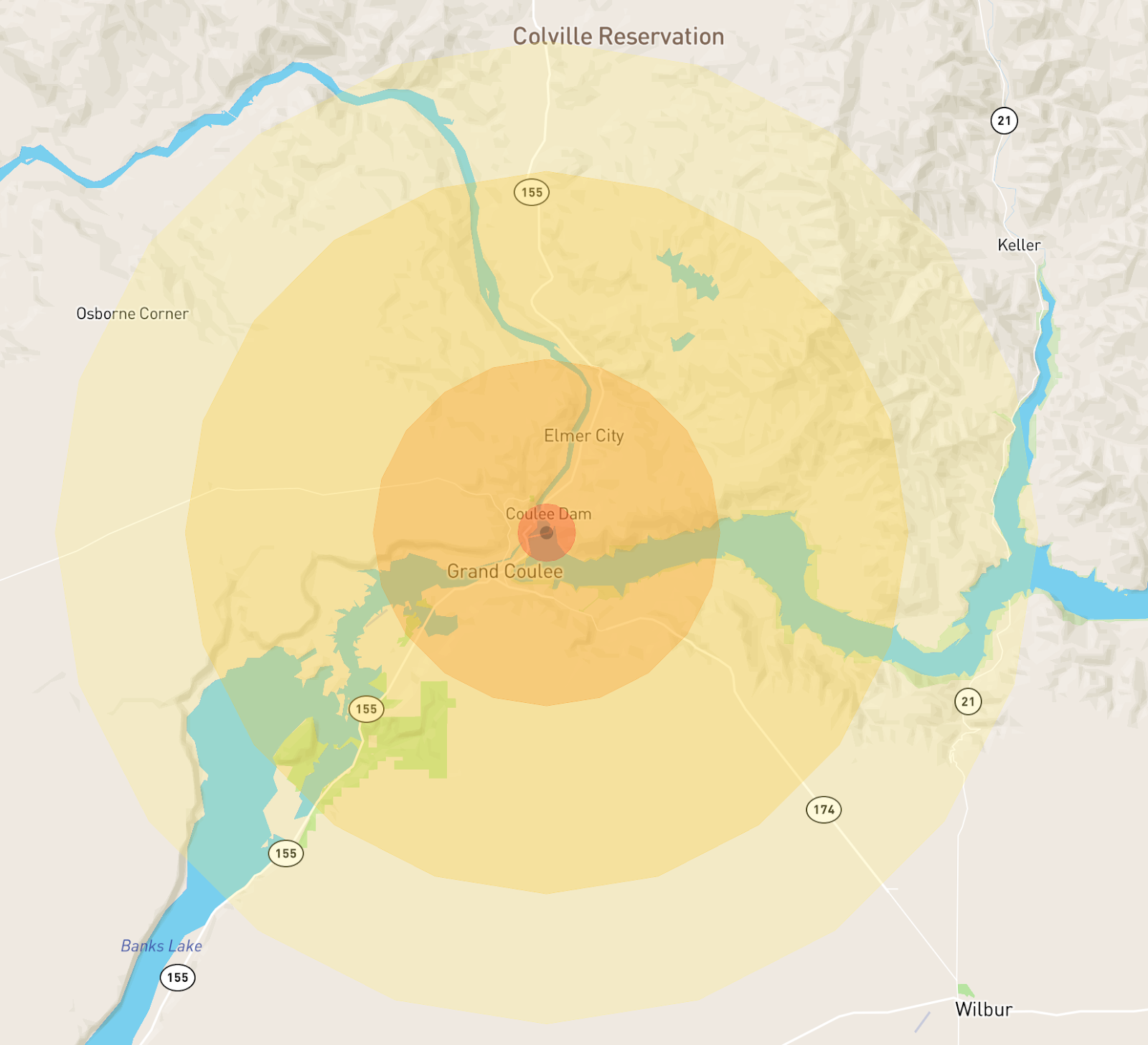
All nuclear blast radii on this map are modeled on a 5 Mt nuclear airburst (a standard Chinese warhead). Damage radii use estimates from Alex Wellerstein’s NUKEMAP; for more info, check out his site. This site renders nuclear blast impacts at 4 levels:
- 2km: Fireball radius
- 12km: Air blast radius (5 psi)
- 25km: Thermal radiation radius
- 34km: Air blast radius (1 psi)
On the map, the zones look something like this:
Modeling nuclear fallout accurately is a lot harder, and I have not attempted it at all. The fallout zones depend on airburst height and wind conditions, which are both dynamic and complex.
Targets
This a quick description of each of the target layers available on bunker.land. Since I don’t know what I’m doing, unless the selection criteria were very obvious, I erred on the side of presenting raw, un-filtered data. So, many minor military bases, railyards etc are included even if they have no real significance.
Likewise, several categories of likely targets are not included yet, including but not limited to airports, refineries, shipyards, factories, and communication facilities.
Military bases
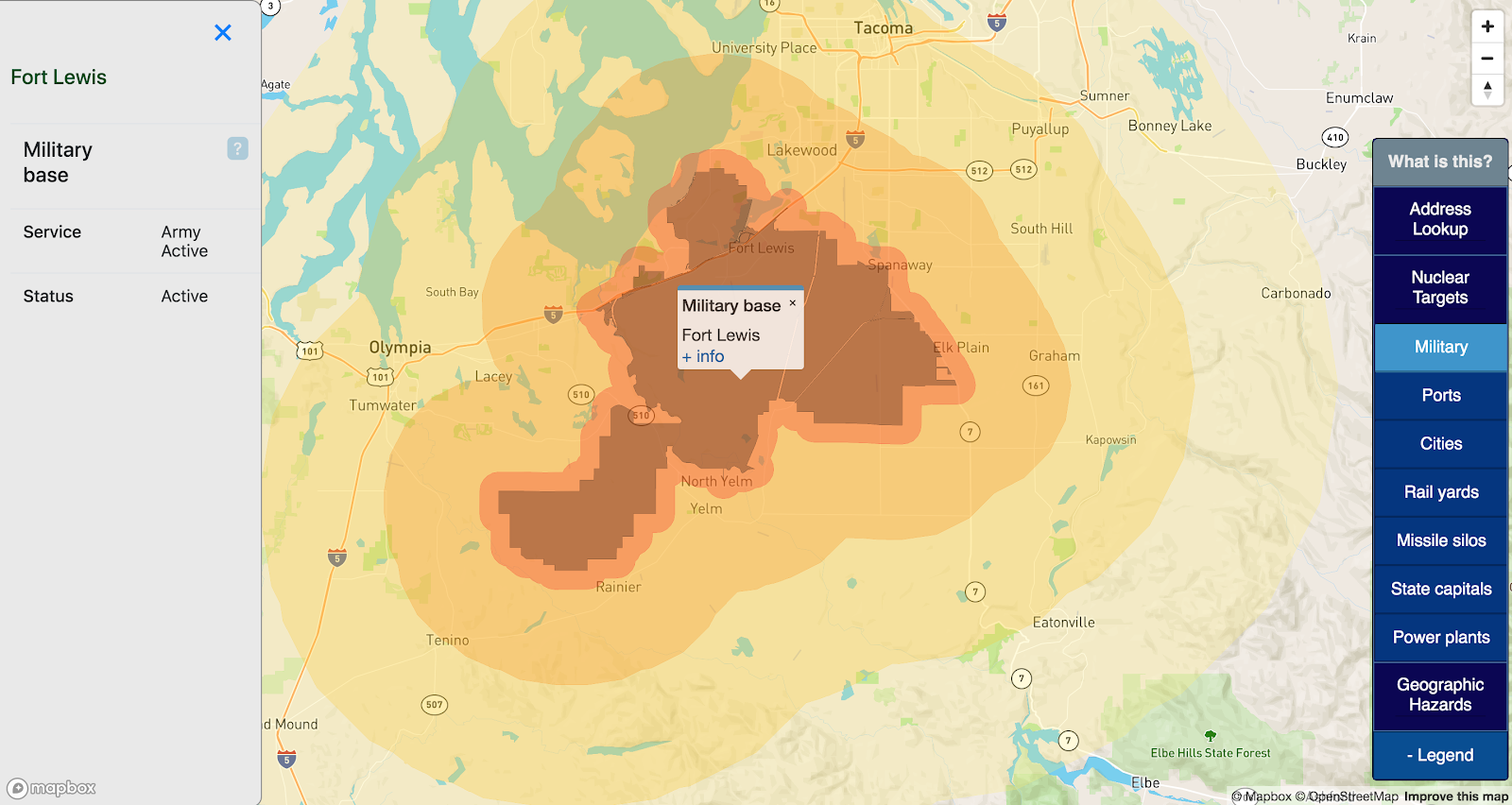
Strategic military bases are obvious targets in a nuclear war. This map displays all US military installations on US soil, with data sourced from the Department of Transportation.
This map makes no effort to distinguish between major and minor strategic targets; all installations are rendered as potential targets.
Ports
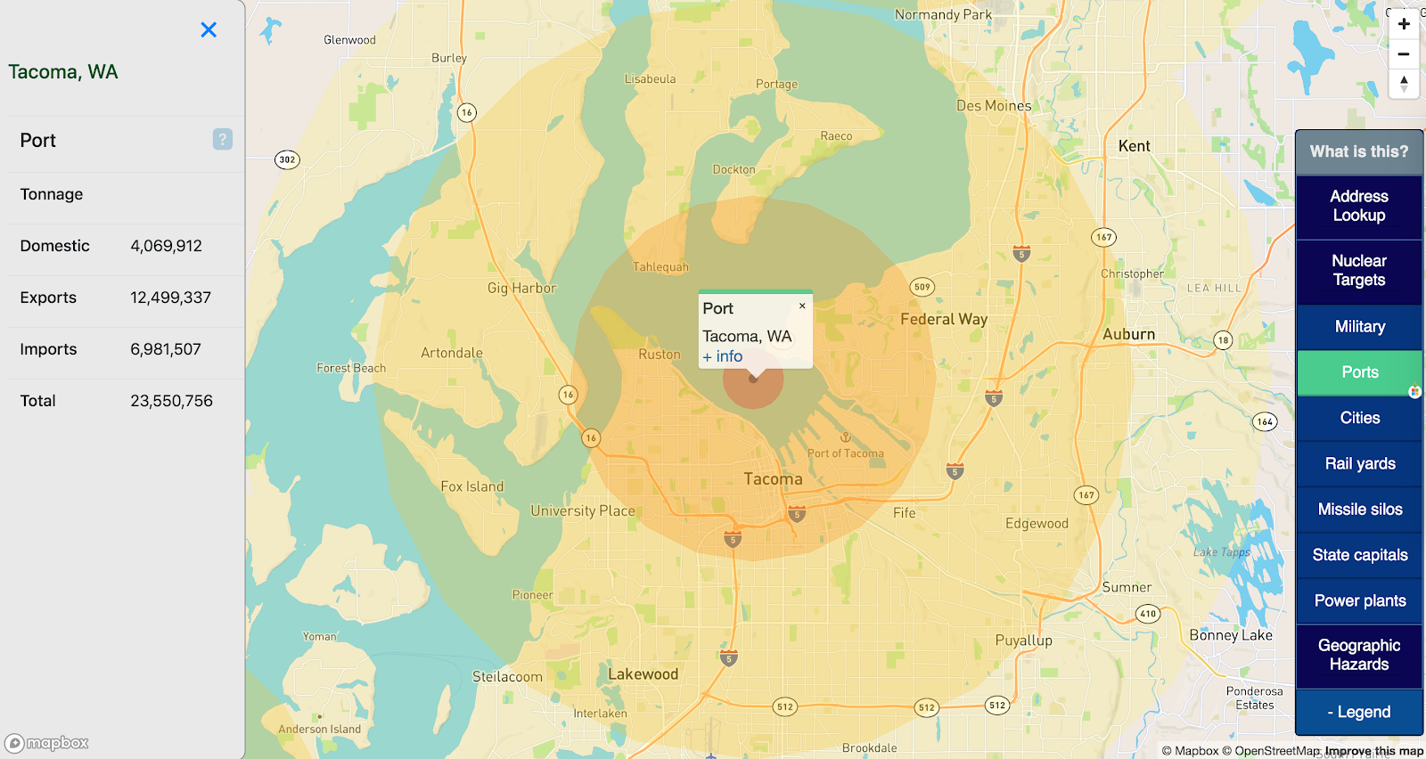
Major US ports are often cited as potential targets in either terrorist attacks or nuclear war, due to their important economic roles and proximity to economic centers.
This map sources a Department of Transportation list of major US ports. No effort was made to filter ports by importance or risk; all ports in this dataset are rendered as potential targets.
Major cities
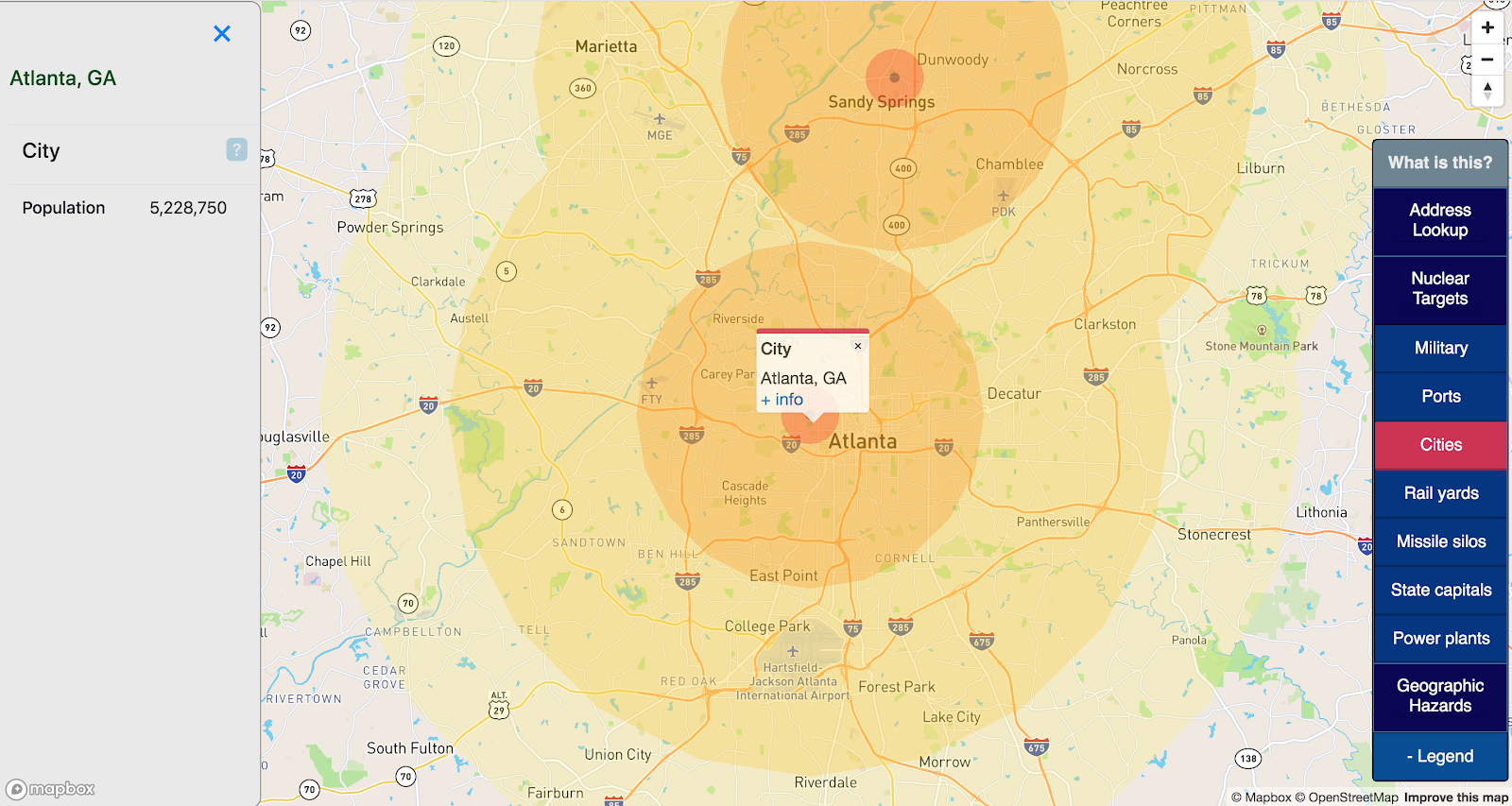
Even in a major nuclear war, most cities are not valuable targets; only cities with important military targets or infrastructure are likely to be targeted.
This map displays all cities with a population over 100,000 (sourced here) only as a proxy for infrastructure that other layers do not capture.
No effort is made to filter cities by risk or strategic importance.
Rail yards
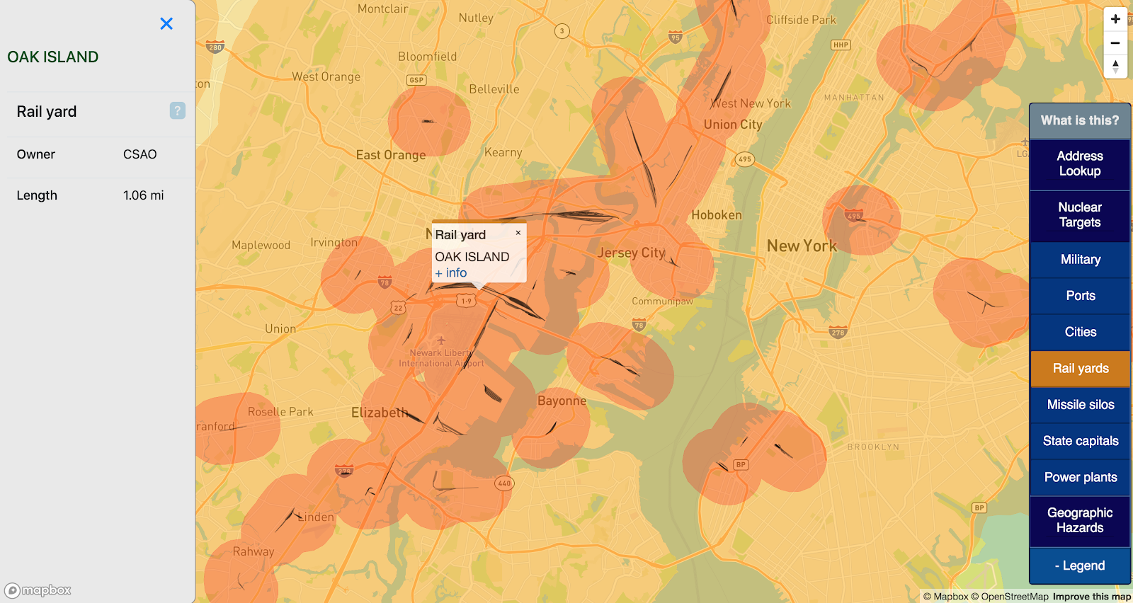
Cold War nuclear targets frequently include transportation hubs such as railyards. This map includes all US rail yards, as sourced from data.gov.
This is a very inclusive map, and most of these rail yards have little to no strategic value. Without a better metric for inclusion though, all US railyards are modeled as potential targets.
ICBM missile silos
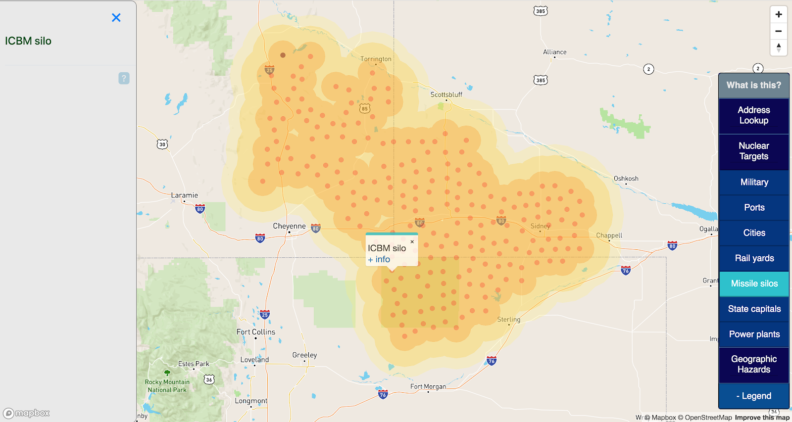
The first priority in a nuclear war is eliminating the enemy’s ability to respond with nuclear weapons. Ground-based nuclear missile silos are very high-value targets.
The United States maintains a ground-based ICBM force of three missile wings spread across Montana, North Dakota, Wyoming, Nebraska, and Colorado.
These silo locations have been sourced from Wikipedia, and no other effort was made to verify operational status.
State capitals
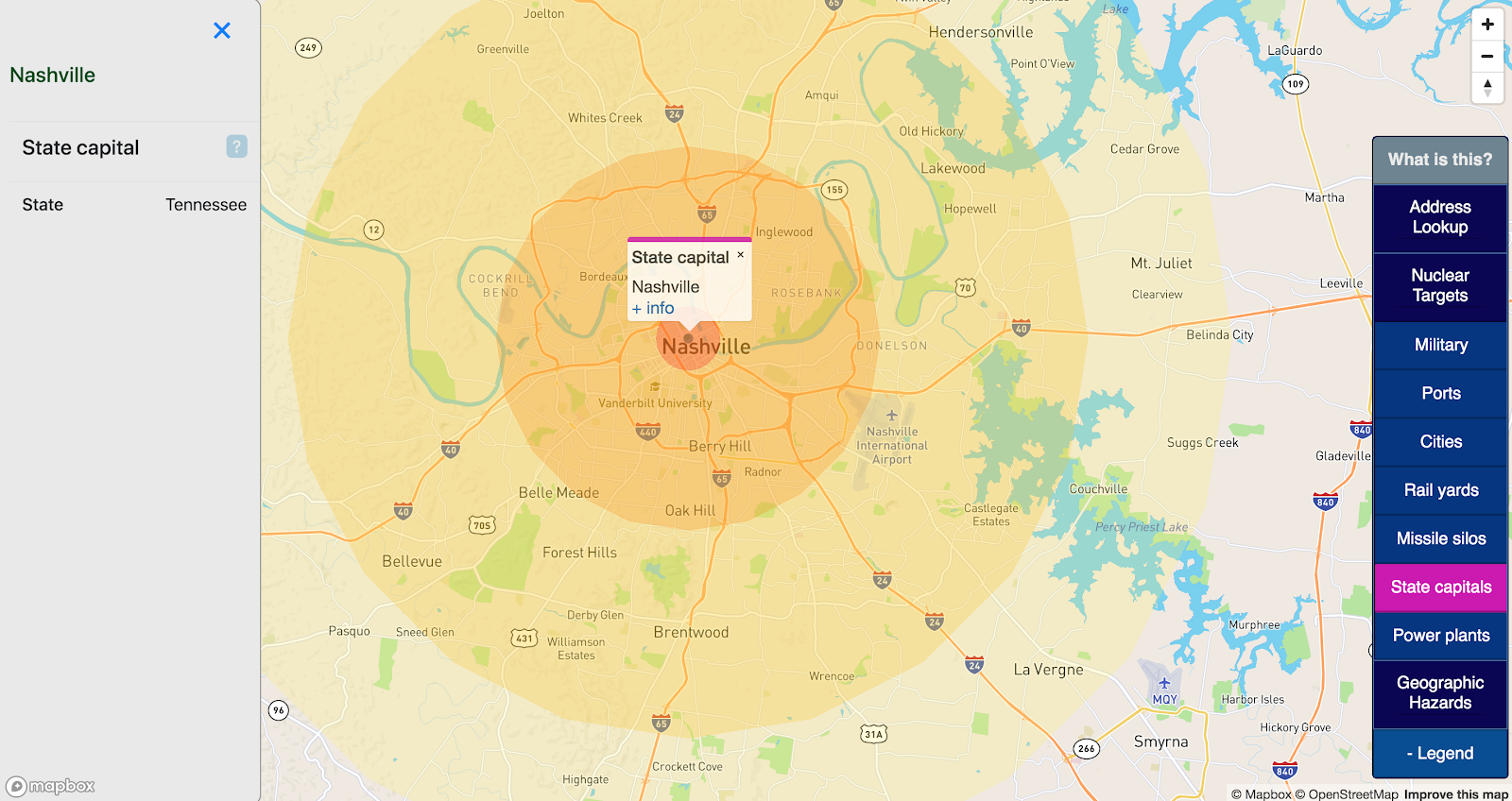
It is generally agreed that US state capitals will be considered high-value targets in a full nuclear war. This map includes all 50 US state capitals as targets.
Power plants
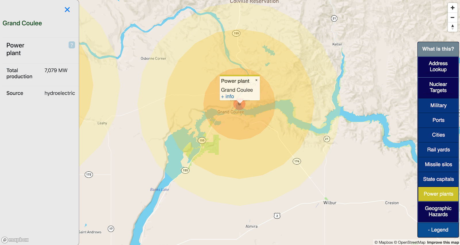
In a nuclear war, power production facilities will be targeted for their military and industrial value. This map pulls from Energy Information Administration datasets all facilities with over 1 GW of capacity, across all production types (coal, hydroelectric, nuclear, etc).
Uncontrolled Sea Level Rise
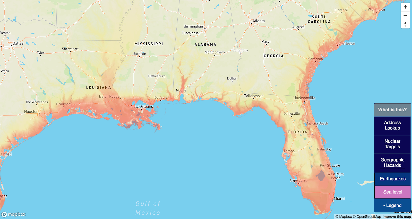
Unlike nuclear war, sea level rise won’t sneak up and vaporize you while you sleep. But it will make a house a really poor investment .
Most realistic global warming worst-case scenarios model a 5-10 foot sea level rise by 2100, which is, to be clear, Very Bad News, but is unlikely to sink you unless you live in the everglades. This map goes further and asks “How far from the ocean would you want to be if all the ice melted — around 220 feet of it.
Elevation data was sourced here, at 100m resolution.
There are a lot of ways global warming could make a place uninhabitable — for example, making it really hot. But this map currently only captures raw sea level rise.
Earthquakes
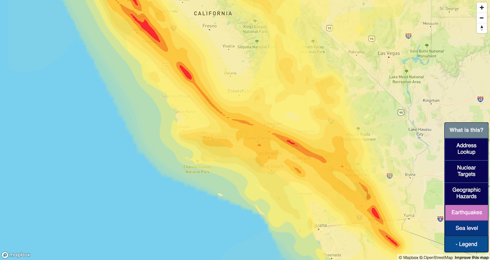
Earthquakes are usually bad news. Earthquake prediction is challenging, but it’s generally understood which areas of the country are most prone to earthquakes. This map attempts to display areas with especially high earthquake risks.
Earthquake risks are pulled from the 2014 USGS seismic-hazard maps found here. ‘Intensity’ represents the peak horizontal acceleration with 10% probability of exceedance in 50 years, measured as a percentage of gravity.
Only areas with over 10% g are rendered on location markers. 10% was only chosen because it is a round number.
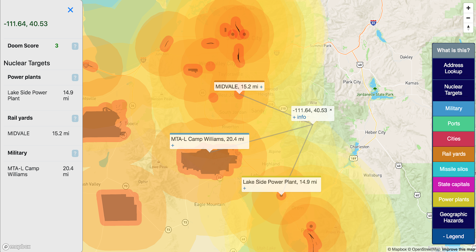
Doom Score
I found that the buffers presented on the map were cool but made it challenging to make a head-to-head numeric comparison between locations. To make this more straightforward, I added a “Doom Score” which aggregates the enabled hazards for a given point:
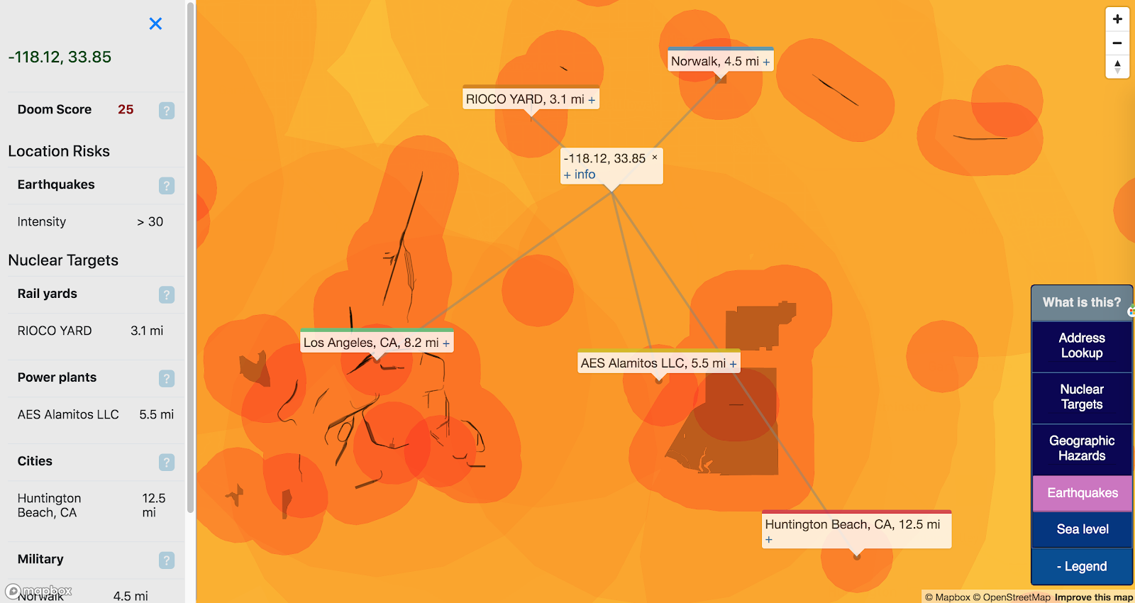
It’s not a sophisticated score: for each enabled target layer, points are assigned by distance:
- 0-2km: 10
- 2-12km: 5
- 12-25km: 2
- 25-34km: 1
Earthquake risk is assigned as the %g exceedance as measured above by 10. Eg, 20% chance of exceedance = 2 points. Summed together, these numbers may not represent a ton, but they are fun to compare.
So while Zillow (and similar services) provide useful info about neighborhoods like “Walk Score” and “Transit Score”, bunker.land is the only place you can get a Doom Score.
Follow-ups / Help
I’m not an expert in anything presented on this map. There’s certainly a lot that could be improved:
- This is by no means an exhaustive list of the things that can kill you. More hazards will (probably) be added to this map over time. Reach out if you have any specific interests (hurricanes, etc).
- Expanded target lists from reliable data-sets (airports, etc)
- Contributions appreciated from actual experts about ways to judge which targets are actually important.
I’ll update as I add content to this site (which may or may not happen frequently). Feature requests and bug reports welcome. Best way to leave feedback is to email me directly at bpodgursky@gmail.com.

3 thoughts on “bunker.land — Mapping the Best Places to Wait out a Nuclear War”