The best gift the Coronavirus can give us? The normalization of remote work

tl,dr: Covid-19, if (or at this point, “when”) it becomes a full pandemic, is going to rapidly accelerate the shift to remote-first tech hiring.  This is an amazing thing. It’s too bad it’ll take a pandemic to get us there.

The focus over the past couple weeks has been on how a pandemic will affect the economy.  This is a reasonable question to ask. But a brief economic downturn is just noise compared to the big structural changes we’ll see in turn — that long-term quarantine and travel restrictions will normalize remote work. It’s already happening, especially in tech companies.  

Remote work is a revolutionary improvement for workers of all stripes and careers, but I’m a tech worker, so I’ll speak from the perspective of a one.

Software development is second only to sales in ability to execute at full capacity while remote*, if given the opportunity.  But willingness to perform tech-first remote hiring has ground forward glacially slowly, especially at the largest and hippest tech companies — and at times, even moved backwards

*I’ve known top sales reps to make their calls on ski lifts between runs.  Software devs can’t quite match that quality-of-life boost.

A prolonged quarantine period (even without a formal government quarantine, tech companies will push hard for employees to work from home) will force new remote-first defaults on companies previously unwilling to make remote work a first-class option:

  • Conversations will move to Slack, MS teams, or the equivalent
  • Videoconferenced meetings will become the default, even if a few workers make it into the office
  • IT departments without stable VPNs (all too common) will quickly fix that problem, as the C-suite starts working from home offices

The shift to normalized remote work will massively benefit tech employees, who have been working for decades with a Hobson’s choice of employment — move to a tech hub, with tech-hub salaries, and spend it all on cost-of-living, or eat scraps:

  • Cost-of-living freedom: SF and New York are inhumanly expensive. Make it practical to pull SF-salaries while living in the midwest? Most SF employees have no concept of how well you can live on $250k in a civilized part of the country.
  • Family balance freedom: operating as an on-site employee with children is hard, and working from home makes it wildly easier to balance childcare responsibilities (trips to school, childcare, etc etc).
  • Commutes suck. Good commutes suck. Terrible commutes are a portal into hell. What would you pay to gain two hours and live 26-hour days? Well, working from home is the closest you can get.

I don’t mean to be callous — deaths are bad, and I wish it upon nobody. But the future is remote-first, and when we get there, history will judge our commute-first culture the same way we judge people in the middle ages for dumping shit on public streets.

I wish it didn’t take a global pandemic to get us here, but if we’re looking for silver linings in the coffins — it’s hard to imagine a shinier one that the remote-normalized culture we’re going to build, by fire, blood, and mucous, over the next six months.  

I’ll take it.

Happy Earth Day: drive more and (maybe) save the environment

Yesterday was Earth Day, so Facebook was naturally full of people bragging about how they walked to the store instead of driving, in order to save the Earth.  I feel obligated to point out that this very plausibly isn’t true.  I’m not the first person to run these numbers, but I was curious and wanted to investigate for myself.  My (rather rough) calculations are all here.

As a baseline, we want to calculate the kWh cost of driving a car 1 mile. I’m using a baseline of 33.41 kWh / gallon of gasoline:

Car MPG kWh/ 1 mile
Prius 58 .58
F-150 19 1.76

If you’re bragging on Facebook about your environmental impact, you’re probably driving a Prius, so we’ll roll with that.  Feel free to substitute your own car.

To get the calories burned per mile walking, I used numbers I found here.  The numbers here vary pretty widely with body weight and walking speed, but I’ll use 180 pounds at 3.0 mph for 95 calories per hour.

To get the energy costs per pound of food produced, I used the numbers I found here.  Click through for their sources.  kWh / 1 mile is calculated as

kWh/1 mile = 180/(calories/lb) * ( kWh/lb)

Just to be clear: this isn’t the calories in food.  This is the energy usage required to produce and transport the food to your mouth, which is essentially all fossil fuels.  Numbers vary widely per food source, as expected.

Food Calories / Lb kWh / Lb kWh / 1 mile
Corn 390 0.43 0.10
Milk 291 0.75 0.24
Apples 216 1.67 0.73
Eggs 650 4 0.58
Chicken 573 4.4 0.73
Cheese 1824 6.75 0.35
Pork 480 12.6 2.49
Beef 1176 31.5 2.54

So what’s the conclusion?  It’s mixed.

  • If you drive a Prius, you’re OK walking, as long as you replace the burned calories with Doritos (cheese + corn) and (corn syrup’d) Coca-Cola
  • If you drive a Prius, and you replace the burned calories with a chicken and apple salad (I couldn’t find numbers for lettuce, but they are undoubtedly even worse), you are destroying the planet
  • If you drive an F-150, you’re probably going to replace your burned calories with a steak, so you’re actually saving the environment by driving.

These numbers are of course rough, and do not include:

  • The energy cost of producing a car.  This becomes very complicated very quickly, becaus you likely would have done less damage by just buying a used car instead of a new Prius
  • This assumes you actually eat all the food you ordered, and didn’t leave carrots rotting in the back of your fridge (your fridge, by the way, uses energy).  Americans are notoriously terrible at doing this.
  • This calculates only energy usage — it does not attempt to quantify the environmental impact of turning Brazilian rainforests into organic Kale farms, to grow your fourth-meal salad.
  • This assumes a single rider per car-mile.  If you are carpooling on your drive to KFC, you can cut all the car energy usage numbers by half (or more, for families)

Anyway, I’m sure there are many other reasons these numbers are rough, I just wanted to point out that the conventional wisdom is pretty awful on environmental topics.

Procedural star rendering with three.js and WebGL shaders

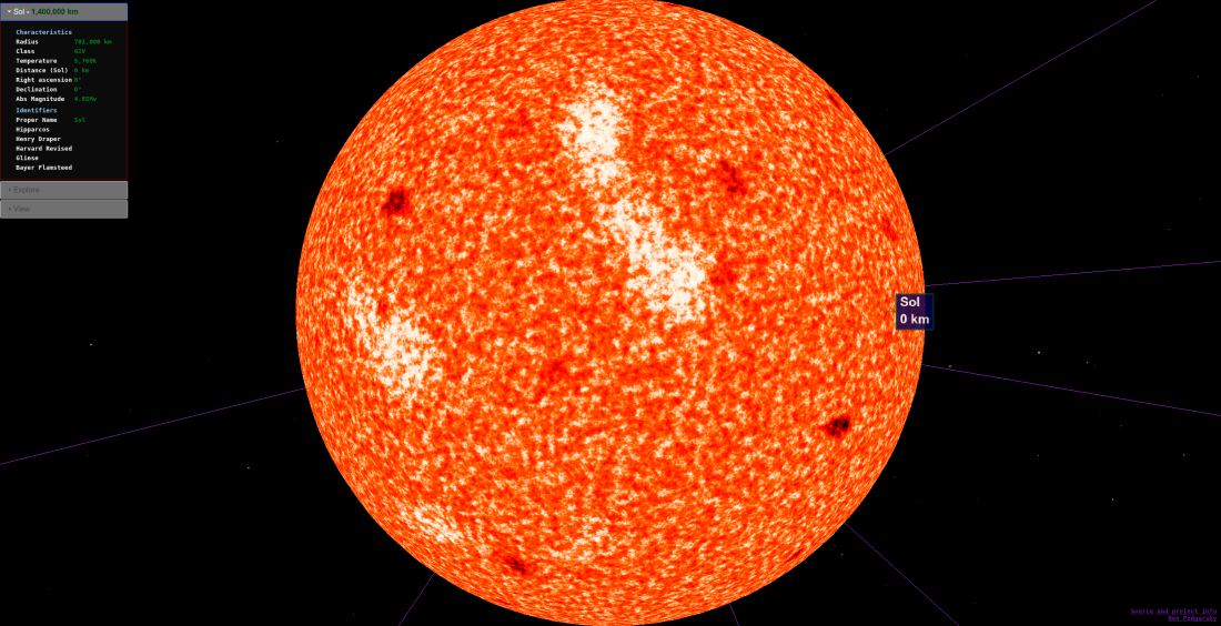
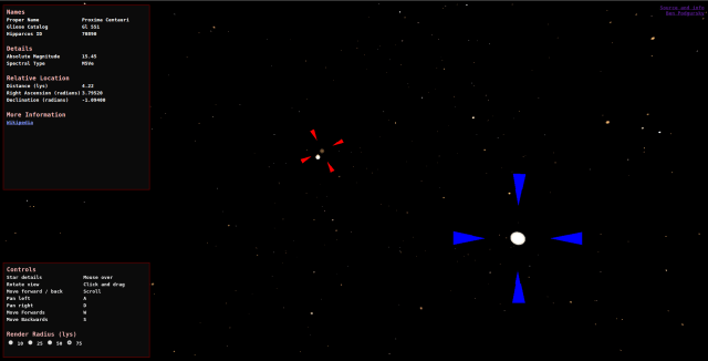
Over the past few months I’ve been working on a WebGL visualization of earth’s solar neighborhood — that is, a 3D map of all stars within 75 light years of Earth, rendering stars and (exo)planets as accurately as possible.  In the process I’ve had to learn a lot about WebGL (specifically three.js, the WebGL library I’ve used).  This post goes into more detail about how I ended up doing procedural star rendering using three.js.  

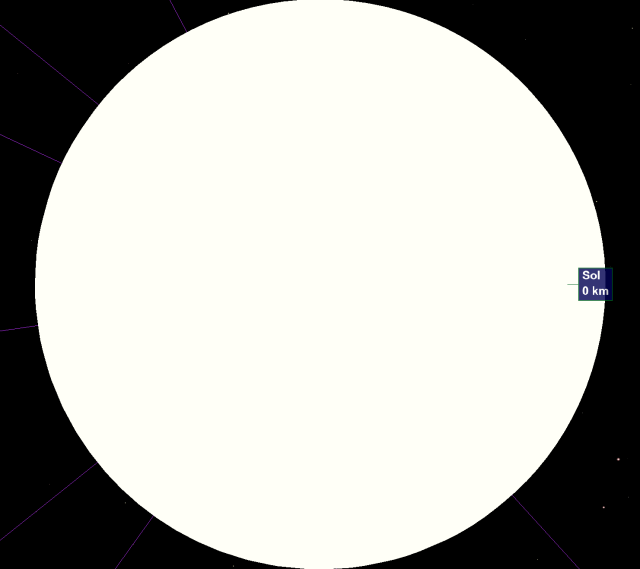
The first iteration of this project rendered stars as large balls, with colors roughly mapped to star temperature.  The balls did technically tell you where a star was, but it’s not a particularly compelling visual:

uncharted-screenshot

Pretty much any interesting WebGL or OpenGL animation uses vertex and fragment shaders to render complex details on surfaces.  In some cases this just means mapping a fixed image onto a shape, but shaders can also be generated randomly, to represent flames, explosions, waves etc.  three.js makes it easy to attach custom vertex and fragment shaders to your meshes, so I decided to take a shot at semi-realistic (or at least, cool-looking) star rendering with my own shaders.  

Some googling brought me to a very helpful guide on the Seeds of Andromeda dev blog which outlined how to procedurally render stars using OpenGL.  This post outlines how I translated a portion of this guide to three.js, along with a few tweaks.

The full code for the fragment and vertex shaders are on GitHub.  I have images here, but the visuals are most interesting on the actual tool (http://uncharted.bpodgursky.com/) since they are larger and animated.

Usual disclaimer — I don’t know anything about astronomy, and I’m new to WebGL, so don’t assume that anything here is “correct” or implemented “cleanly”.  Feedback and suggestions welcome.

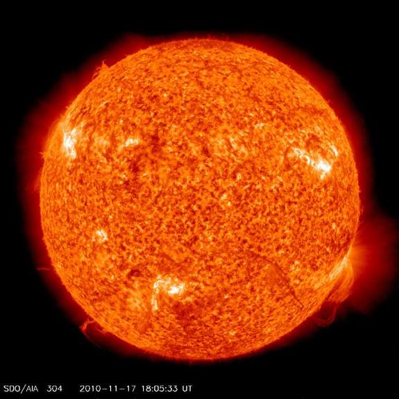
My goal was to render something along the lines of this false-color image of the sun:

sun

In the final shader I implemented:

  • the star’s temperature is mapped to an RGB color
  • noise functions try to emulate the real texture
    • a base noise function to generate granules
    • a targeted negative noise function to generate sunspots
    • a broader noise function to generate hotter areas
  • a separate corona is added to show the star at long distances

Temperature mapping
The color of a star is determined by its temperature, following the black body radiation, color spectrum:

color_temperature_of_a_black_body

(sourced from wikipedia)

Since we want to render stars at the correct temperature, it makes sense to access this gradient in the shader where we are choosing  colors for pixels.  Unfortunately, WebGL limits the size of uniforms to a couple hundred on most hardware, making it tough to pack this data into the shader.

In theory WebGL implements vertex texture mapping, which would let the shader fetch the RGB coordinates from a loaded texture, but I wasn’t sure how to do this in WebGL.  So instead I broke the black-body radiation color vector into a large, horrifying, stepwise function:

bool rbucket1 = i < 60.0; // 0, 255 in 60 bool rbucket2 = i >= 60.0 && i < 236.0;  //   255,255
…
float r =
float(rbucket1) * (0.0 + i * 4.25) +
float(rbucket2) * (255.0) +
float(rbucket3) * (255.0 + (i - 236.0) * -2.442) +
float(rbucket4) * (128.0 + (i - 288.0) * -0.764) +
float(rbucket5) * (60.0 + (i - 377.0) * -0.4477)+
float(rbucket6) * 0.0;

Pretty disgusting.  But it works!  The full function is in the shader here

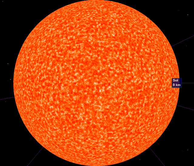
Plugging in the Sun’s temperature (5,778) gives us an exciting shade of off-white:

sun-no-noise

While beautiful, we can do better.

Base noise function (granules)

Going forward I diverge a bit from the SoA guide.  While the SoA guide chooses a temperature and then varies the intensity of the texture based on a noise function, I instead fix high and low surface temperatures for the star, and use the noise function to vary between them.  The high and low temperatures are passed into the shader as uniforms:

 var material = new THREE.ShaderMaterial({
   uniforms: {
     time: uniforms.time,
     scale: uniforms.scale,
     highTemp: {type: "f", value: starData.temperatureEstimate.value.quantity},
     lowTemp: {type: "f", value: starData.temperatureEstimate.value.quantity / 4}
   },
   vertexShader: shaders.dynamicVertexShader,
   fragmentShader: shaders.starFragmentShader,
   transparent: false,
   polygonOffset: -.1,
   usePolygonOffset: true
 });

All the noise functions below shift the pixel temperature, which is then mapped to an RGB color.

Convection currents on the surface of the sun generate noisy “granules” of hotter and cooler areas.  To represent these granules an available WebGL implementation of 3D simplex noise.    The base noise for a pixel is just the simplex noise at the vertex coordinates, plus some magic numbers (simply tuned to whatever looked “realistic”):

void main( void ) {
float noiseBase = (noise(vTexCoord3D , .40, 0.7)+1.0)/2.0;

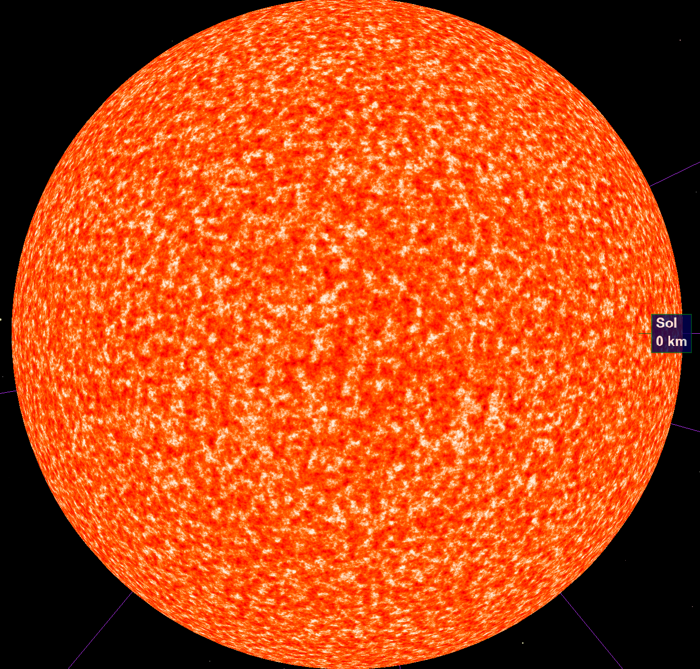
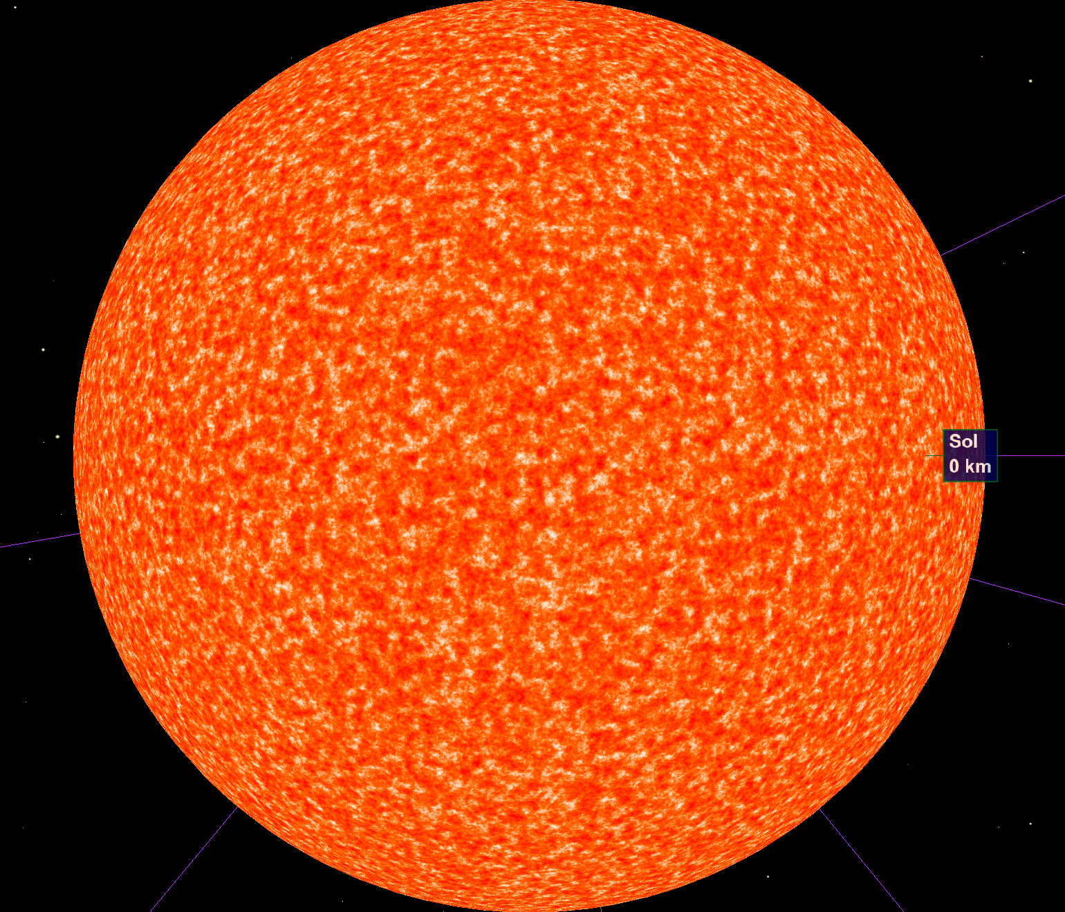
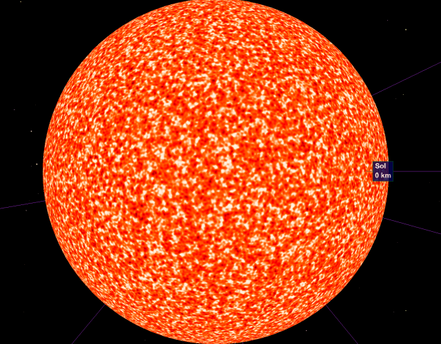
The number of octaves in the simplex noise determines the “depth” of the noise, as zoom increases.  The tradeoff of course is that each octave increases the work the GPU computes each frame, so more octaves == fewer frames per second.  Here is the sun rendered at 2 octaves:

sun-2-octaves

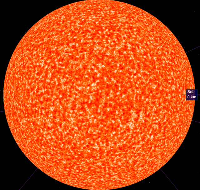
4 octaves (which I ended up using):

sun-4-octaves

and 8 octaves (too intense to render real-time with acceptable performance):
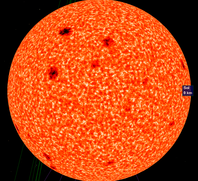
sun-8-octaves

Sunspots

Sunspots are areas on the surface of a star with a reduced surface temperature due to magnetic field flux.  My implementation of sunspots is pretty simple; I take the same noise function we used for the granules, but with a decreased frequency, higher amplitude and initial offset.  By only taking the positive values (the max function), the sunspots show up as discrete features rather than continuous noise.  The final value (“ss”) is then subtracted from the initial noise.

float frequency = 0.04;
float t1 = snoise(vTexCoord3D * frequency)*2.7 -  1.9;
float ss = max(0.0, t1);

This adds only a single snoise call per pixel, and looks reasonably good:

sunspots-impl

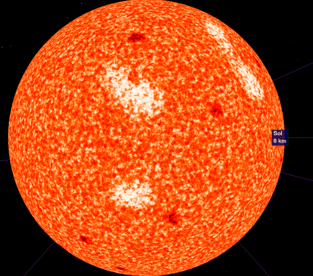
Additional temperature variation

To add a bit more noise, the noise function is used one last time, this time to add temperature in broader areas, for a bit more noise:

float brightNoise= snoise(vTexCoord3D * .02)*1.4- .9;
float brightSpot = max(0.0, brightNoise);

float total = noiseBase - ss + brightSpot;

All together, this is what the final shader looks like:

sun-final

Corona

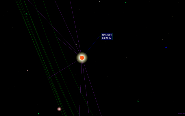
Stars are very small, on a stellar scale.  The main goal of this project is to be able to visually hop around the Earth’s solar neighborhood, so we need to be able to see stars at a long distance (like we can in real life).  

The easiest solution is to just have a very large fixed sprite attached at the star’s location.  This solution has some issues though:

  • being inside a large semi-opaque sprite (ex, when zoomed up towards a star) occludes vision of everything else
  • scaled sprites in Three.js do not play well with raycasting (the raycaster misses the sprite, making it impossible to select stars by mousing over them)
  • a fixed sprite will not vary its color by star temperature

I ended up implementing a shader which implemented a corona shader with

  • RGB color based on the star’s temperature (same implementation as above)
  • color near the focus trending towards pure white
  • size was proportional to camera distance (up to a max distance)
  • a bit of lens flare (this didn’t work very well)

Full code here.  Lots of magic constants for aesthetics, like before.

Close to the target star, the corona is mostly occluded by the detail mesh:

corona-close

At a distance the corona remains visible:

corona-distance

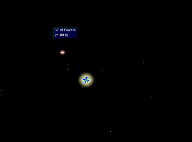
On a cooler (temperature) star:

corona-flare

The corona mesh serves two purposes

  • calculating intersections during raycasting (to enable targeting stars via mouseover and clicking)
  • star visibility

Using a custom shader to implement both of these use-cases let me cut the number of rendered three.js meshes in half; this is great, because rendering half as many objects means each frame renders twice as quickly.

Conclusions

This shader is a pretty good first step, but I’d like to make a few improvements and additions when I have a chance:

  • Solar flares (and other 3D surface activity)
  • More accurate sunspot rendering (the size and frequency aren’t based on any real science)
  • Fix coronas to more accurately represent a star’s real visual magnitude — the most obvious ones here are the largest ones, not necessarily the brightest ones

My goal is to follow up this post a couple others about parts of this project I think turned out well, starting with the orbit controls (the logic for panning the camera around a fixed point while orbiting).  

3d Map of our Solar Neighborhood using three.js

A few months ago I stumbled on three.js, a library which exposes a simple WebGL interface.  I was really impressed at both the performance of WebGL and how easy three.js made building high-performance animations in the browser.

I thought this would be a good opportunity to put together a visualization I’ve been looking for for a while–a map of our solar neighborhood, showing all the closest stars to our own.  The data-set I used was the HYG database of nearby stars, which is a compilation of all stars within 50 parsecs.  I’ve cross-referenced stars against wikipedia where available.   The site is available here:

http://uncharted.bpodgursky.com/

Screenshot:

uncharted-screenshot

The whole project is open-source, hosted here.

The project isn’t nearly as polished as I would have liked (there’s a long to-do list on the github page), but I’m trying to commit to releasing projects rather than letting them die silently.  I’m hoping to be able to iterate on the remaining issues over the next few months.

Thoughts, suggestions, or contributions always welcome here or on the GitHub page.

Updates to language vs income breakdown post

Thanks to everyone who commented and read through my post last night.  The post got a lot more attention than I expected (on hacker news and reddit at least).    Many comments both here and on those threads quite reasonably pointed out problems with the data presented.  I should have been a lot more clear initially about the caveats and issues, and put those at the front of the post instead of the end.

I’d like to try to address some of the concerns raised when possible, and be clear about which problems I don’t see an easy way of fixing:

Confidence intervals

Many commenters have noted that the results are not significant without including confidence measures.  In retrospect I should have calculated confidence intervals from the beginning instead of just the mean values; I had assumed incorrectly that the n=100 cutoff would keep the error low enough to ignore, but that was a mistake.  Below is an updated graph with 95% confidence intervals:

incomes

and the numbers:

Language Mean Lower Upper Samples
Puppet 87,589.29 77,726.24 97,452.33 112
Haskell 89,973.82 82,773.72 97,173.92 191
PHP 94,031.19 90,956.90 97,105.47 978
CoffeeScript 94,890.80 90,025.16 99,756.45 435
VimL 94,967.11 90,735.70 99,198.51 532
Shell 96,930.54 93,771.76 100,089.33 979
Lua 96,930.69 86,169.26 107,692.13 101
Erlang 97,306.55 88,631.11 105,981.98 168
Clojure 97,500.00 91,448.24 103,551.76 269
Python 97,578.87 95,481.64 99,676.10 2314
JavaScript 97,598.75 95,897.67 99,299.83 3443
Emacs Lisp 97,774.65 92,503.64 103,045.65 355
C# 97,823.31 94,116.76 101,529.86 665
Ruby 98,238.74 96,471.81 100,005.68 3242
C++ 99,147.93 95,633.62 102,662.23 845
CSS 99,881.40 95,361.99 104,400.82 527
Perl 100,295.45 97,172.79 103,418.12 990
C 100,766.51 98,602.83 102,930.19 2120
Go 101,158.01 94,435.87 107,880.15 231
Scala 101,460.91 94,925.79 107,996.02 243
ColdFusion 101,536.70 93,627.35 109,446.05 109
Objective-C 101,801.60 97,560.43 106,042.77 562
Groovy 102,650.86 94,601.74 110,699.99 116
Java 103,179.39 100,474.36 105,884.42 1402
XSLT 106,199.19 96,887.72 115,510.65 123
ActionScript 108,119.47 99,297.36 116,941.58 113

As it turns out, the commenters who noted that the top and bottom languages were likely because of small samples were correct.  Although the confidence ranges of the top and bottom groups don’t overlap, the difference is not as clear-cut as the means would suggest.

I’m going to try to gather some data from sparser-represented languages to clean this up, and will update here when I have better numbers (this might take a while because of API rate limiting.)

Household Income vs Personal Income

Many commenters noted that these numbers use household income rather than personal income.  This is a limitation of the data sets I’m using rather than voluntary; the Rapleaf API only returns household income.  Rather than give up I decided to use the household measure instead.

This is not ideal, but I don’t think it is a critical flaw; for this difference to skew the results, authors of certain languages would need significantly different marriage patterns or a tendency to marry richer / poorer spouses relative to other languages.  This is not impossible, but I think the results are still useful with this caveat in mind.

If anyone can suggest a data set with personal incomes I can use instead, I’ll gladly use those.  Otherwise I’ll be more clear that the incomes are household rather than personal.

Correcting for Confounding Variables

The original numbers did not attempt to adjust for any other variables, some of the more obvious being age and location.  It’s been suggested that I look into using partial dependence plots to separate out other variables.  I’ll be taking a look at that over the next few days.

Missing Languages

Unfortunately there’s not a lot I can do about many missing languages; many are not recognized by GitHub (SQL, among others).  As I gather more data, I’ll include the languages which were omitted here because of sample size.

Thanks again to everyone who read and commented.  I’m going to process the lessons here and be more careful when posting numbers in the future (I’d still like to give similar breakdowns for gender and age soon.)

Average Income per Programming Language

Update 8/21:  I’ve gotten a lot of feedback about issues with these rankings from comments, and have tried to address some of them here The data there has been updated to include confidence intervals.

———————————————————————————————————

A few weeks ago I described how I used Git commit metadata plus the Rapleaf API to build aggregate demographic profiles for popular GitHub organizations (blog post here, per-organization data available here).

I was also interested in slicing the data somewhat differently, breaking down demographics per programming language instead of per organization.  Stereotypes about developers of various languages abound, but I was curious how these lined up with reality.  The easiest place to start was age, income, and gender breakdowns per language. Given the data I’d already collected, this wasn’t too challenging:

  • For each repository I used GitHub’s estimate of a repostory’s language composition.  For example, GitHub estimates this project at 75% Java.
  • For each language, I aggregated incomes for all developers who have contributed to a project which is at least 50% that language (by the above measure).
  • I filtered for languages with > 100 available income data points.

Here are the results for income, sorted from lowest average household income to highest:

Language Average Household Income ($) Data Points
Puppet 87,589.29 112
Haskell 89,973.82 191
PHP 94,031.19 978
CoffeeScript 94,890.80 435
VimL 94,967.11 532
Shell 96,930.54 979
Lua 96,930.69 101
Erlang 97,306.55 168
Clojure 97,500.00 269
Python 97,578.87 2314
JavaScript 97,598.75 3443
Emacs Lisp 97,774.65 355
C# 97,823.31 665
Ruby 98,238.74 3242
C++ 99,147.93 845
CSS 99,881.40 527
Perl 100,295.45 990
C 100,766.51 2120
Go 101,158.01 231
Scala 101,460.91 243
ColdFusion 101,536.70 109
Objective-C 101,801.60 562
Groovy 102,650.86 116
Java 103,179.39 1402
XSLT 106,199.19 123
ActionScript 108,119.47 113

Here’s the same data in chart form:

Language vs Income

Most of the language rankings were roughly in line with my expectations, to the extent I had any:

  • Haskell is a very academic language, and academia is not known for generous salaries
  • PHP is a very accessible language, and it makes sense that casual / younger / lower paid programmers can easily contribute
  • On the high end of the spectrum, Java and ActionScript are used heavily in enterprise software, and enterprise software is certainly known to pay well

On the other hand, I’m unfamiliar with some of the other languages on the high/low ends like XSLT, Puppet, and CoffeeScript.  Any ideas on why these languages ranked higher or lower than average?

Caveats before making too many conclusions from the data here:

  • These are all open-source projects, which may not accurately represent compensation among closed-source developers
  • Rapleaf data does not have total income coverage, and the sample may be biased
  • I have not corrected for any other skew (age, gender, etc)
  • I haven’t crawled all repositories on GitHub, so the users for whom I have data may not be a representative sample

That said, even though the absolute numbers may be biased, I think this is a good starting point when comparing relative compensation between languages.

Let me know any thoughts or suggestions about the methodology or the results.  I’ll follow up soon with age and gender breakdowns per language in a similar fashion.

Using CoreNLP, d3.js, and dagre.js to visualize sentence parse trees

I’ve always been casually interested in the field of Natural Langauge Processing (NLP), a  field of computer science interested in extracting information from natural human language. I have no training or education whatsoever in the field so I’m not in a position to contribute much to the field, but I am definitely interested in seeing where the state of the art is, and in particular how powerful open-source NLP libraries have gotten (Google and Microsoft certainly have more powerful closed-source systems, but that doesn’t really help me.)

A few years ago I started playing with Apache’s OpenNLP project.  I’m a big fan of the Apache foundation and their libraries, but I found myself very frustrated by OpenNLP’s lack of documentation and the hacky-feeling interfaces the library exposed.  However recently I took another look at the available NLP libraries and came across Stanford’s CoreNLP project.   CoreNLP, as it turns out, is an awesome project, and it took almost zero effort to get their example demo working.

As a total NLP beginnner, the sentence parsing functionality was the most immediately approachable example.  Sentence parsing takes a natural-English sentence:

“I am parsing an example sentence.”

and breaks it down into component tokens and their relations:

(ROOT (S (NP (PRP I)) (VP (VBP am) (VP (VBG parsing) (NP (DT an) (NN example) (NN sentence)))) (. .)))

where each token type corresponds to a particular word type–“NP”  means “Noun Phrase”, VBG means “Verb, gerund or present participle”, and so forth (I’ve been referencing this as a complete token list.)

I’ve also been looking into JavaScript graph visualization libraries recently (I’ve struggled to find a JS library remotely as powerful and pretty as graphviz), and wanted to test out the dagre library, which re-implements a simplified dot algorithm in javascipt and can render the results to d3 (the current coolest-kid-on-the-block JS graph library).  So I put the two together and put together a simple visualization which uses dagre to show CoreNLP’s sentence parse tree.  It’s pretty simple, but you can play with it here.

nlp-screenshot-cropped

When I have time to work with the two libraries a bit more I’ll hopefully update with something more interesting.

Github Demographics

For the past couple weeks I’ve been working on a project to visualize and compare the demographics of popular GitHub organizations by combining data from the the RapLeaf and GitHub APIs.   By pulling emails from Git commit data and querying the Rapleaf API for demographic data, I was able to put together an aggregate picture of the age + gender + income of people who have contributed to a GitHub organization (shown below for the Rails organization)

gitstats-screenshot

  • See more details on how the data was gathered here,
  • See organization ranked by age / gender / income here
  • Browse all available organizations here.

I’ll be following up soon with some thoughts on the results.  For now, I’ll just point out that Linux kernel developers make serious bank.