I posted a couple days ago about how I used QGIS to generate heatmaps of tornado activity based on raw point data. Since I had invested time (kind of) learning the tool, I figured I should put together a few similar layers.
The most obvious choice was hurricane risk. I ended up using a pretty similar procedure to when I generated the tornado heatmap, but massaging the data took a few extra steps:
- The input data came as vectors instead of points
- My data covered the whole globe, but I wanted the final vectors to only cover land areas
Again, I was happy with the result, so I figured I’d write it up.
Similar to what I ran into with the tornado risk data, I couldn’t find any hurricane hazard GIS shapefiles. I did again find a raw dataset of all hurricanes the NOAA has records on, which was enough to get started.
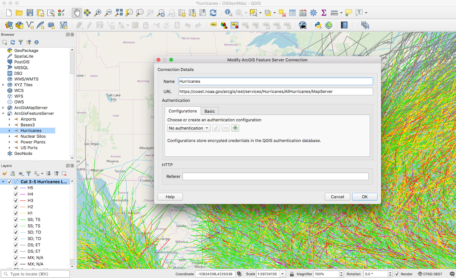
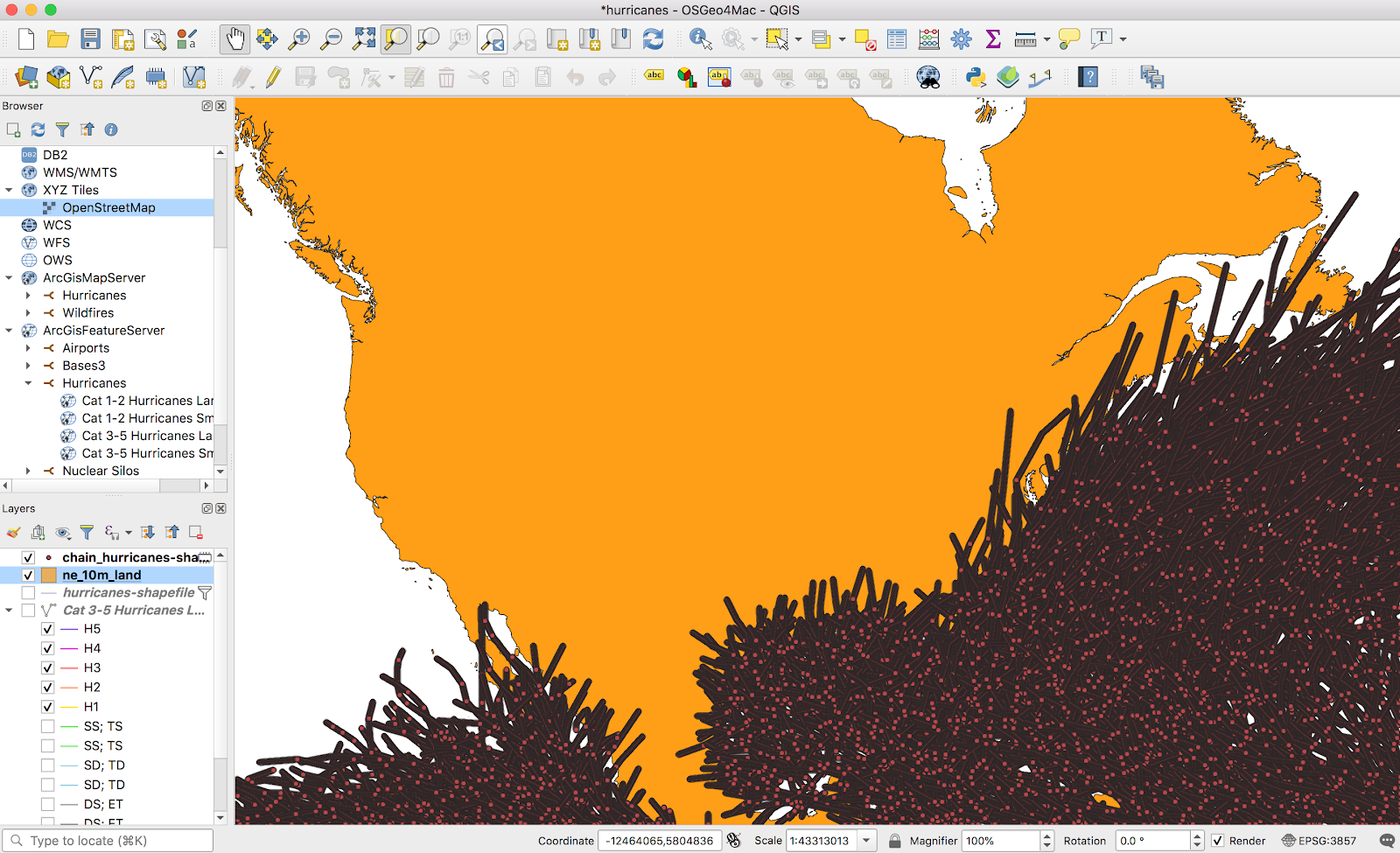
Importing all the vectors (I think there were about 700,000) from this MapServer took a while, and the result was, as expected, a bit cluttered:
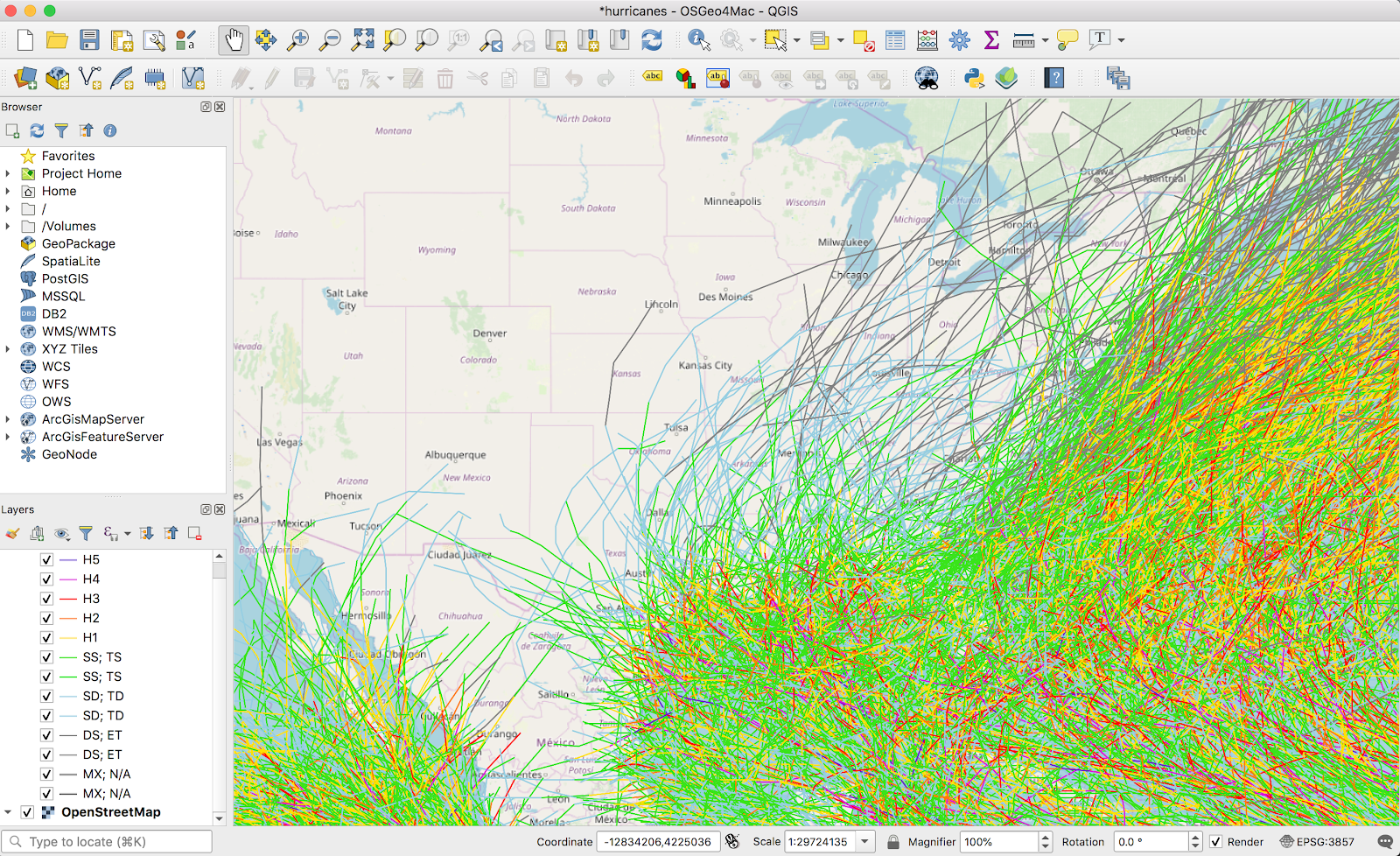
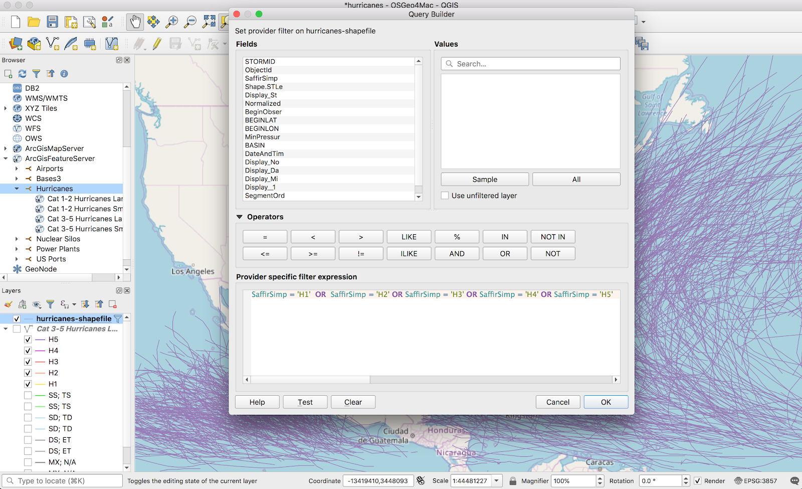
There’s probably a better way to filter the data down, but I ended up exporting the records to shapefiles so I could filter on attributes. The dataset had a lot of tropical storm data, and I filtered out everything except proper hurricanes (H1-H5).
Here things got a bit different. The heatmap function I used for tornadoes only works on points, and these vectors were all lines. Luckily, there was a brute force but straightforward solution: turn the line into a bunch of points. QChainage is a simple plugin that does exactly that. Once it’s installed, it’s available from the Vector → QChainage menu.
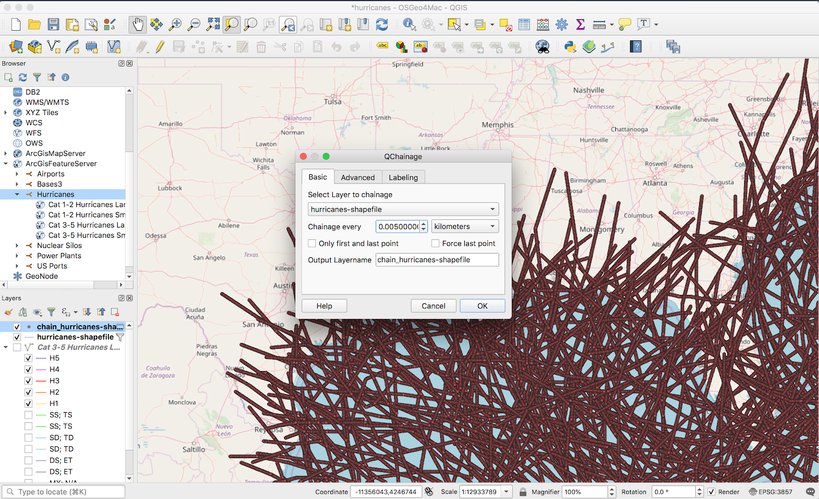
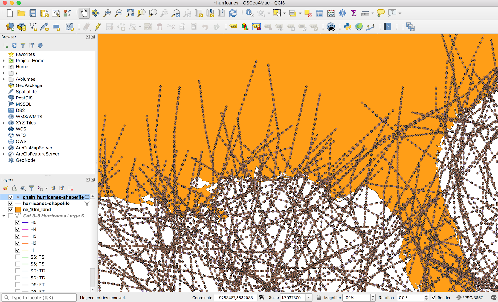
The above screenshot is a bit deceptive — I ended up using a point spacing of 20km in the final version. The only main downside of a higher frequency is longer processing time when generating the heatmap. The result kind of looks a mess from above:
But looks a lot better once I zoom in:
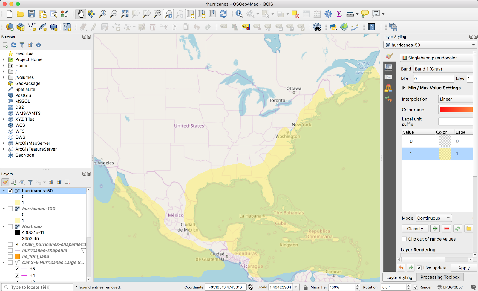
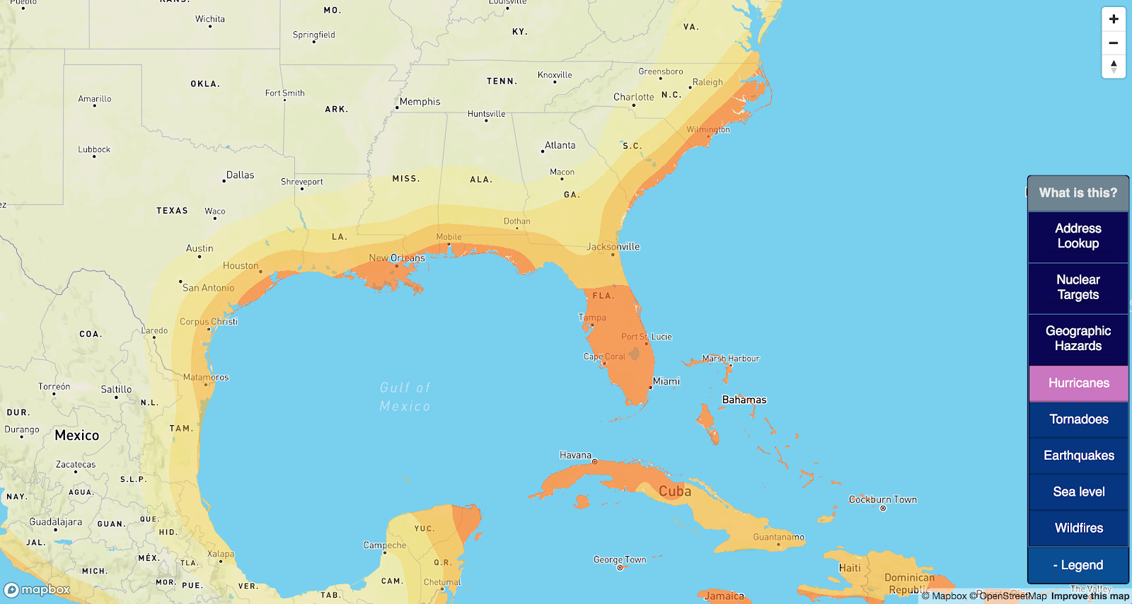
From here, I’ll fast forward through the same stuff I did last time; I used the points to generate a heatmap, this time using 250km point radii, and pulled a vector out of it. I iterated on thresholds until the most expansive layer more-or-less lined up with other reputable sources. My layer:
Compared to what I found online (source):
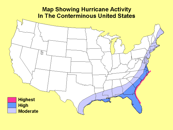
Except for a few lumps in Virginia and Maine, it looks pretty comparable.
Jumping forward a bit more, I again went with four gradients to get a map that looked like this:
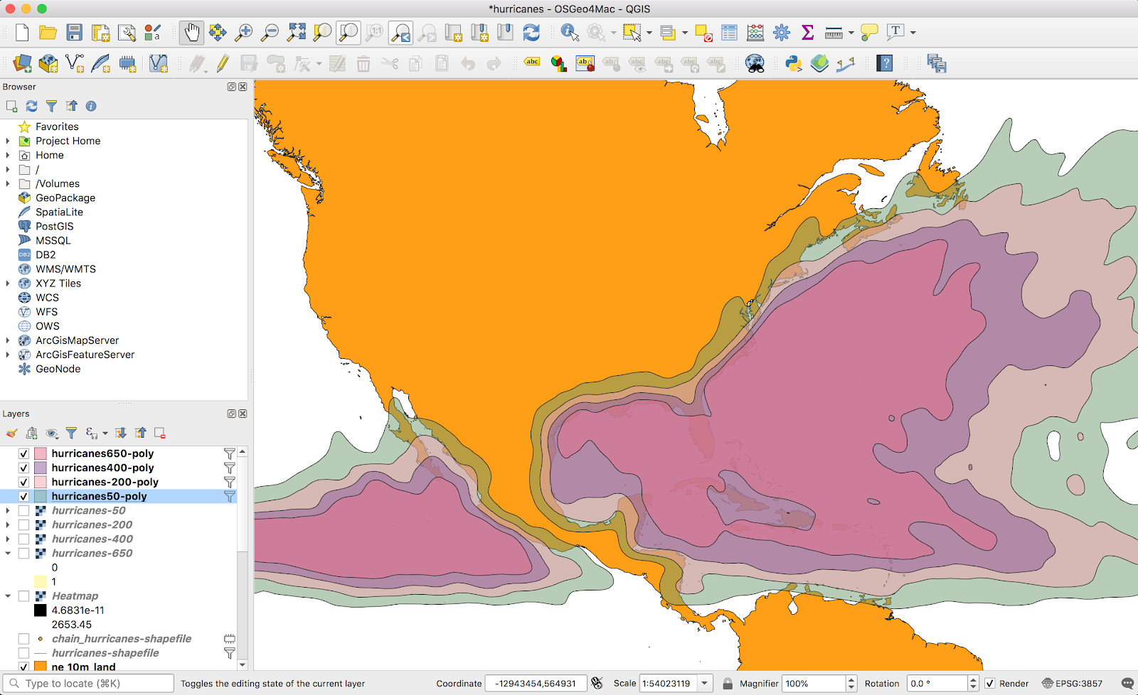
I was a bit torn. While this looks cool, the highlights on the ocean are distracting when the goal is to highlight risk areas on land; I needed to filter the shapes down to only land areas.
It turns out, intersecting vectors in QGIS is pretty easy. I found a simple shapefile of all land areas on earth here (it wasn’t even a big download — less than 10MB). Once this data was imported, I could use the Vector → Geoprocessing tools → Intersect tool to generate an intersection layer:
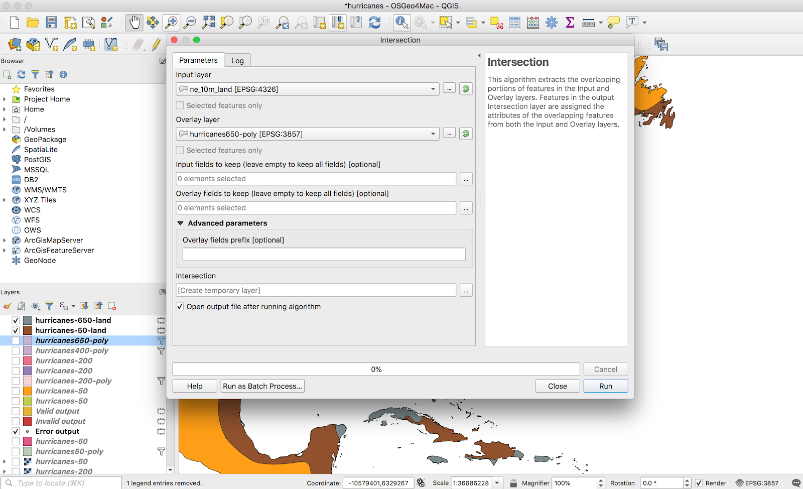
This did exactly what I wanted. I repeated this for all four layers and ended up with a gradient only over land areas, exactly what I wanted. I didn’t bother styling the layers, since I’ll just handle that in Mapbox later.
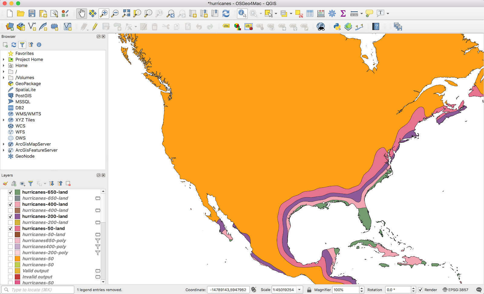
Just as a sanity check, I swapped back in the openmaptiles background to make sure the coastlines lined up correctly (they did, except a few hundred meters here and there on the coastline).

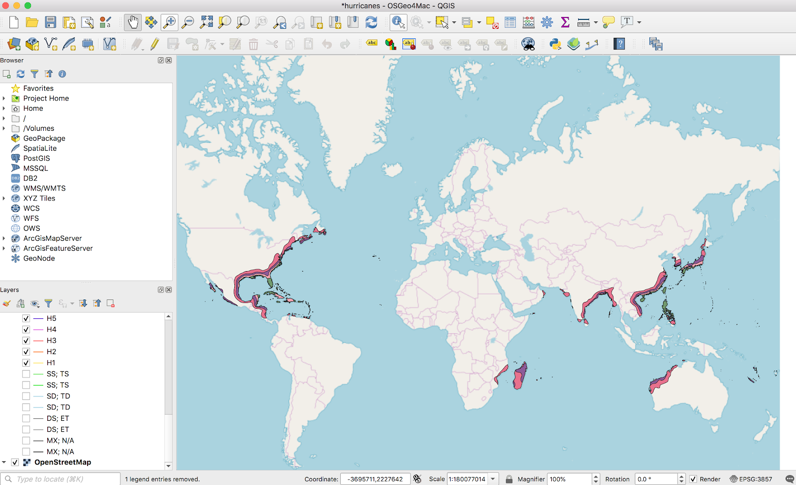
A nice bonus from this NOAA data: this time the data covered the whole globe. All the other datasets I’ve found for other natural disaster risks are US-specific (and usually only the continental US):
I won’t go through the details on loading this into Mapbox; everything from here mirrored what I did last time. You can see the result as a layer on bunker.land:
Once again I was pleasantly surprised at how easy it was to get (relatively) nice looking graphics from QGIS with minimal experience.
At this point I’ve added data for most the layers I was interested in displaying (although I’m open to suggestions). I’ll likely get back to the actual web-dev side of this project and clean up a few loose ends over the next couple weekends.

One thought on “More QGIS – Hurricane maps (lines to points and vector overlaps)”